Cracking the Sales Data Analysis Assessment
A practical walkthrough of the HR assessment dataset — covering SIS reports, SAP dumps, SFA stock data, and DSR trends — with every formula and approach explained from first principles.
-
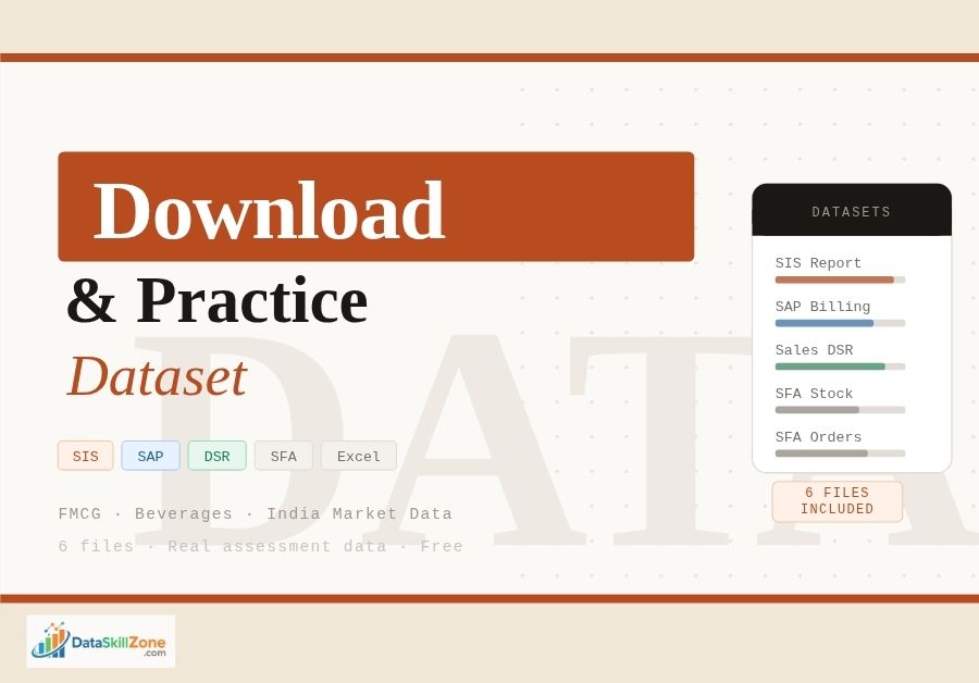
Data – SIS.xlsx↓ Download
-
Sales_DSR.xls↓ Download
-
SAP_data.xlsx↓ Download
-
SFA_Stock_Report.xlsx↓ Download
-
SFA_Order_Report.xlsx↓ Download
-
Questions – SIS.docx↓ Download
What this assessment actually tests
This is a classic FMCG sales analyst assessment. The recruiter is not just checking whether you know VLOOKUP — they want to see how you think about a business. The six files span two years of secondary sales, distributor (CP) billing data, outlet-level field operations, and territory scorecards.
Before you open a single file, take two minutes to read the question document carefully. The instructions call out specific columns by letter — that is not a suggestion, it is a clue. Assessors who designed this have a model answer in mind, and it references those exact columns.
Every question ends with “(refer column X, Y, Z)”. Your pivot tables must pull data from those exact columns. Using a different column — even if the data looks similar — will score zero on a structured rubric.
Brand-wise growth & contribution
Two years of DSR data — monthly trends, % growth vs prior year, % contribution by brand.
CP billing from SAP
Month-wise unique channel partners billed, then drill further by SKU level.
SIS territory review
Review against multiple parameters, highlight concern areas, populate the summary sheet.
Outlet stock & order analysis
Outlet-wise SKU availability, billing frequency, and quantity trends from SFA field data.
Understanding the six datasets
Most candidates fail this step — they open every file and start building formulas without pausing to understand what each file represents. Here is what is actually inside each one.
SIS (Secondary Information System) — Data_-_SIS.xlsx
This is your territory performance scorecard. The GO sheet contains a region → RGM HQ → AGM HQ → GO HQ hierarchy with columns for secondary sales targets, actual sales, % target achievement, last year actuals, and % growth. Focus SKU data appears in the right-hand columns. This file is your primary lens for identifying underperforming territories.
Sales DSR — Sales_DSR.xls
DSR stands for Daily Sales Report — aggregated monthly over two years in this context. Each row represents a brand-month combination with sales volume in cases. You will derive month-over-month trends and year-over-year comparisons from this file.
SAP Data Dump — SAP_data.xlsx
This is the distributor (Channel Partner) billing file exported from SAP. Each row is one invoice line. The columns the assessment asks about are H (Month), B (Buyer/CP code), and K (Invoice Qty), along with J (Unique SKU description) for the SKU-level question.
| Column | Field Name | Used For |
|---|---|---|
| Col B | BUYER | CP code — numeric ID of each distributor |
| Col H | Month | Month label for pivot grouping (Nov, Oct, etc.) |
| Col J | Uniq Desp / SKU | Unique product description (Frooti Tetra 160ml, etc.) |
| Col K | Inv Qty | Invoice quantity in cases — volume metric |
The SAP data has one row per invoice line, not one row per CP. A single distributor billed in November might appear 20+ times. “Unique CP billed” means counting distinct CP codes in Col B — not counting rows.
SFA Stock Report
Covers one field week (Sep 18–25, 2014). Each row is an outlet-SKU-visit combination. The three columns flagged in the question are G (Outlet ID), AA (Available Stock Qty in Cases), and AH (Stock Amount in ₹).
SFA Order Report
Same structure, same field team, same week — but records orders placed rather than stock on hand. Brands include Frooti (multiple variants), Appy Fizz, Appy CL, and Café Cuba. Use this to cross-reference whether low-stock outlets actually placed replenishment orders.
Solving the Sales DSR analysis
The DSR task has three deliverables: % growth, % contribution, and monthly trend — all at brand level. Work through these in order.
-
Create a Brand × Month pivot table
Insert → PivotTable on the DSR sheet. Drag Brand to Rows, Month to Columns, Sales Volume (Cases) to Values (Sum). This becomes your base matrix.
-
Build a Year 1 vs Year 2 comparison layout
Create two separate pivot tables — one per year — and place them side-by-side so Year 1 and Year 2 figures for each brand-month sit in adjacent columns.
-
Calculate % Growth (YoY)% YoY Growth
= (Year2_Sales - Year1_Sales) / Year1_SalesFormat as Percentage. Apply conditional formatting: negative values in red, positive in green.
-
Calculate % Contribution by Brand% Contribution
= Brand_Monthly_Sales / $C$18 ← lock the Grand Total denominator with $Each brand’s monthly sales divided by all-brand monthly total. Lock the denominator so it does not shift when you copy down.
-
Insert a line or combo chart for monthly trend
Select the month-wise brand totals → Insert → Line Chart. Add a secondary axis if brands have very different volume scales. Include year range in the chart title.
| Brand | Oct Y1 | Nov Y1 | Oct Y2 | Nov Y2 | YoY Growth | % Contrib |
|---|---|---|---|---|---|---|
| Frooti Tetra 160ml | 4,820 | 5,200 | 5,680 | 6,100 | +17.3% | 31.4% |
| TCA Frooti 100ml | 3,100 | 3,450 | 3,820 | 4,050 | +21.2% | 24.6% |
| Appy Fizz 500ml | 2,200 | 2,580 | 2,100 | 2,300 | −7.8% | 13.8% |
| Frooti Pet 2000ml | 1,890 | 2,100 | 2,400 | 2,650 | +25.3% | 16.1% |
Frooti Tetra formats are growing, suggesting NCSD momentum. Appy Fizz 500ml declining may reflect pricing pressure or competitor shelf gains in the CSD segment — flag this as a concern area in your commentary.
SAP data: counting unique CPs billed
This is fundamentally a deduplication problem. You have tens of thousands of invoice rows, but the question asks: in each month, how many distinct distributors were actually billed?
Method 1 — PivotTable with Distinct Count (recommended)
Insert PivotTable → check “Add this data to the Data Model” → place Month (Col H) in Rows and Buyer/CP Code (Col B) in Values → change aggregation to Distinct Count. One step, no formula needed.
Method 2 — SUMPRODUCT formula (any Excel version)
Unique CPs in a given month (e.g. “Nov”)=SUMPRODUCT((H2:H10000="Nov") / COUNTIFS(H2:H10000, H2:H10000, B2:B10000, B2:B10000))This divides 1 by the count of each CP-month combination then sums — effectively counting each unique CP once per month.
Unique CPs billed — with SKU level (Col J)
For the second question you need unique Month + CP + SKU combinations. Add the SKU field (Col J) as a third criterion:
Unique CP-SKU combinations in a month=SUMPRODUCT(
(H2:H10000="Nov") *
1/COUNTIFS(
H2:H10000, H2:H10000,
B2:B10000, B2:B10000,
J2:J10000, J2:J10000
)
)If Col J has blank entries, COUNTIFS will group all blanks together and the formula divides by a large number incorrectly. Wrap the denominator in MAX(...,1) or filter out blank rows first.
- CPs billed count falling vs prior month (lapsing distributors)
- CPs active for only 1 SKU (narrow breadth)
- Months with zero CP billing in a territory
- Month-on-month increase in unique CPs
- New CPs billed for premium SKUs (Pet 2000ml)
- High SKU breadth per CP (>4 SKUs)
SIS business review — identifying concern areas
The SIS file has a GO-level performance matrix. Your job is to populate the summary sheet and surface the red flags. Assessors expect 3–5 structured insights, not just a filled-in table.
Key metrics to compute per territory (GO HQ)
-
% Target Achievement
Verify the column:
= Actual_Sales / Target. Flag below 75% as red, 75–90% as amber, above 100% as green. Use a 3-color conditional formatting scale. -
% Growth vs Last Year
Territories with negative growth despite a reasonable target have declined both in market and performance — these need the strongest flag in your commentary.
-
Focus SKU performance
Compare Focus SKU % TGT ACH against overall % TGT ACH. A territory can hit 80% overall but only 20% on Focus SKUs — serious because Focus SKUs are the margin-drivers.
-
125% CAP analysis
Territories capped at 1.25x may have had unrealistically low targets. If they grew 40% YoY but were capped, the target-setting process needs review — a different kind of concern.
“Bhubaneswar GO4 is at 22% target achievement” is data. “Bhubaneswar GO4 has achieved only 22% with a 3-month downward trend and Focus SKU at 18% — this territory needs immediate field intervention” is an insight. Assessors reward interpretation, not transcription.
SFA outlet stock & order analysis
The SFA files cover one field week. The assessment asks for an outlet-wise × SKU-wise view showing visit frequency and whether stock quantity is rising or stagnant.
Column reference — Stock Report
| Column | Field | What to do with it |
|---|---|---|
| Col G | Outlet ID | Primary grouping key in your pivot (Rows) |
| Col AA | Available Stock Qty (Cases) | Sum per outlet-SKU; track day-wise to see if restocking occurred |
| Col AH | Stock Amount (₹) | Value of stock held — prioritise high-value outlets with zero stock |
Building the outlet × SKU matrix
PivotTable → Outlet Name in Rows, Uniq SKU Desc (last column) in Columns, Available Stock Qty in Values. This creates a matrix view of which outlet holds which SKU at what quantity.
Counting billing frequency per outlet
Add a Count of Outlet ID to your pivot — this tells you visit frequency per outlet over the week. An outlet visited 5 times in 7 days with consistently zero stock is a critical availability failure worth calling out explicitly.
COUNTIF helper column=COUNTIF($G$2:$G$50000, G2) ← paste in a helper column to show each outlet's visit count- Outlets with 0 cases across all visits despite 4+ visits = perennial OOS
- TCA Frooti 85ml (high velocity) vs Pet 2000ml (home consumption) — stocking pattern should differ by outlet type
- A-CLASS outlets with zero Focus SKU = highest-priority concern
- VLOOKUP Outlet IDs across Stock and Order files to link them
- Order placed but no stock change → CP has not fulfilled the order
- Stock present but no order → passive replenishment (market-pull)
Formula & technique reference
VLOOKUP — linking SAP CP codes to names
=VLOOKUP(B2, SAP_data!$B:$E, 4, FALSE)B2 = CP code in summary sheet. Column 4 of the range returns Buyer Name. Always use FALSE for ID-based exact lookups.
VLOOKUP only looks rightward. If the field you need is left of the lookup column, use INDEX+MATCH: =INDEX(SAP!$A:$A, MATCH(B2, SAP!$B:$B, 0))
SUMIF and SUMIFS
=SUMIF(H:H, "Nov", K:K)
=SUMIFS(K:K, H:H, "Nov", B:B, 645)   ← two conditions: month AND specific CP
Array formula — unique count (Ctrl + Shift + Enter)
{=SUM(1/COUNTIF(B2:B10000, B2:B10000))}Enter with Ctrl+Shift+Enter. Curly braces appear automatically — do not type them manually.
Quick formula reference
Conditional formatting heat map
Select the % TGT ACH column → Home → Conditional Formatting → New Rule → “Format all cells based on their values” → 3-Color Scale → Red at 0%, Yellow at 75%, Green at 100%. The whole column becomes instantly scannable.
Macros (VBA)
Record a macro that refreshes all pivot tables at once and formats the summary sheet. Name it clearly (e.g. Sub RefreshAndFormat()). Add a comment at the top of every Sub explaining what it does — assessors who open macro-enabled workbooks appreciate readable code.
Structuring your final output
The question explicitly asks for a presentation (PPT). In a sales analytics context that means: one chart or table per slide, three-second-glance readability, and one sentence of insight beneath each visual.
Recommended slide flow
-
Executive Summary (1 slide)
3–4 bullets maximum. Top brand by growth, top concern territory, one CP billing insight, one SFA finding. Write this slide last.
-
Brand Sales Trend (2 slides)
Slide 1: Line chart — monthly trend for top 4 brands, two-year overlay. Slide 2: Bar chart — YoY % growth by brand sorted descending, declining brands in red.
-
CP Billing Health (1–2 slides)
Month-wise unique CP count as a bar chart with a MoM change line overlay. Table below shows top 5 and bottom 5 months.
-
Territory Concern Matrix (1 slide)
Table with traffic-light conditional formatting on % TGT ACH, sorted by worst performance. Assessors expect Bhubaneswar and similar lagging territories to be prominently flagged.
-
Outlet Stock & Availability (1 slide)
Top 10 outlets by visit count with average stock level. Highlight high-visit-frequency / near-zero-stock outlets as systemic distribution failures.
-
Recommendations (1 slide)
Three to five actionable points tied directly to the data. “Prioritise CP activation in months where billings dropped below X” is actionable. “Improve sales” is not.
Use a single consistent colour scheme across all charts — same orange for Frooti, same blue for Appy Fizz throughout. Colour-coding brands consistently signals to assessors that you think in systems, not isolated charts.