Last Updated: May 2026
Introduction
In my daily work as an MIS Executive, I deal with sales data almost every day. Usually, the data comes in raw format – thousands of rows with outlet names, SKUs, quantities, and sales values.
At first, it looks confusing and difficult to understand. But once you structure it properly in Excel, it becomes very powerful.
Over time, I learned how to convert this raw data into a simple dashboard that clearly shows performance. In this guide, I’ll show you the same step-by-step process that I use in real work.
If you are new to Excel, you can also check my detailed guide on Excel skills for data analysis to build a strong foundation.
Sales data analysis in Excel means converting raw sales data into useful insights using tools like Pivot Tables, charts, and dashboards. By cleaning and organizing data properly, you can easily identify top-performing products, high-sales areas, and overall business trends.
Step 1: Understanding the Raw Sales Data
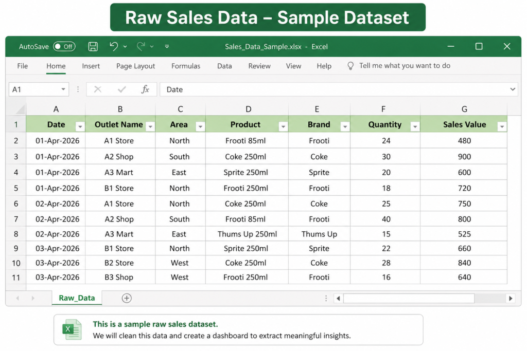
Before doing any analysis, the first step is to understand how your data is structured.
In most real-world scenarios, sales data looks something like this:
| Date | Outlet Name | Area | Product | Brand | Quantity | Sales Value |
|---|---|---|---|---|---|---|
| 01-Apr | A1 Store | North | Frooti 85ml | Frooti | 24 | 480 |
| 01-Apr | A2 Shop | South | Coke 250ml | Coke | 30 | 900 |
In my daily work, I usually receive similar data from multiple outlets. Each row represents one transaction, and when combined, it becomes a large dataset.
If your data is well-structured like this, analysis becomes much easier.
📥 Download Practice Dataset
You can create a similar dataset in Excel or use your company data to practice this method step by step.
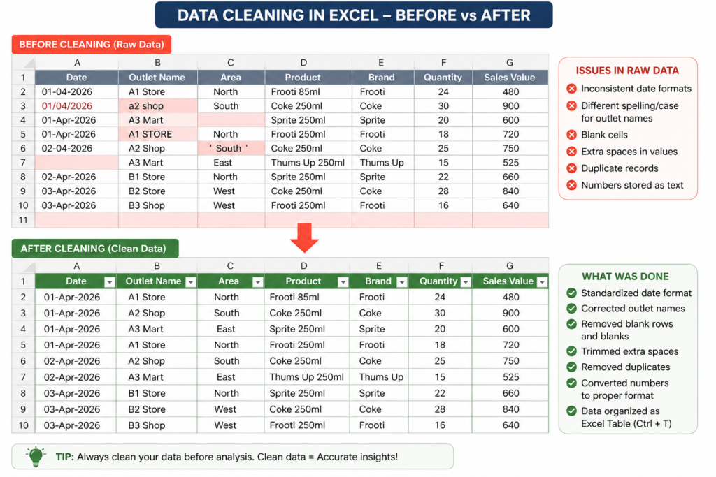
Download Excel FileStep 2: Data Cleaning (Very Important)
Before starting any analysis, I always make sure the data is clean. In real work, raw data is never perfect — it always has small issues.
If you skip this step, your entire analysis can go wrong.
According to Microsoft, proper data formatting and cleaning is essential for accurate analysis in Excel.
Here’s what I usually check:
- Remove blank rows or empty entries
- Check if date format is correct (very important for monthly analysis)
- Standardize outlet names (e.g., “A1 Store” vs “A1 store”)
- Remove duplicate records
- Ensure quantity and sales values are in number format
In my daily MIS reports, even small errors in data can lead to wrong insights, so I always spend a few minutes cleaning data first. Data cleaning is one of the most important steps in analysis. I have explained this in detail in my guide on how to design MIS reports in Excel.
💡 Practical Tip
One simple trick I use is:
Convert the dataset into an Excel Table (Ctrl + T)
This helps in:
- Automatic filtering
- Better formatting
- Easy expansion when new data is added
Proper sales data analysis in Excel always starts with clean and structured data.
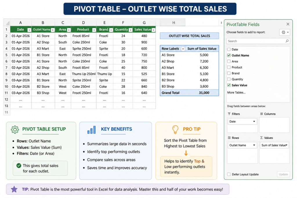
Step 3: Creating Pivot Table (Core of Analysis)
After cleaning the data, the next step I follow is creating a Pivot Table. This is the most powerful feature in Excel for data analysis.
Instead of manually checking thousands of rows, Pivot Table summarizes everything in seconds.
Pivot Tables play a key role in sales data analysis in Excel, especially when dealing with large datasets.
You can also learn more about Pivot Tables from Microsoft’s official Excel documentation.
How I Use Pivot Table in My Daily Work
In my MIS reporting, I usually create a pivot table to quickly check outlet-wise performance.
Basic setup I use:
- Rows: Outlet Name
- Values: Sales Value (Sum)
- Filters: Date or Area
This instantly shows total sales for each outlet.
Why Pivot Table is Important
From my experience, Pivot Tables help in:
- Quickly summarizing large data
- Identifying top-performing outlets
- Comparing sales across areas
- Saving a lot of time
Earlier, I used to calculate things manually, but now Pivot Table does everything in seconds. If you want to go deeper into analysis techniques, you can also check my guide on SQL for data analysis, which is widely used in real-world projects.
💡 Practical Example
Let’s say you have 5000+ rows of data.
Without Pivot:
You will struggle to understand anything
With Pivot:
You get a clean summary like:
| Outlet Name | Total Sales |
|---|---|
| A1 Store | 5,000 |
| A2 Shop | 7,200 |
| A3 Mart | 6,300 |
👉 This is how I quickly prepare daily reports.
Pro Tip (Very Useful)
One thing I always do:
Sort Pivot Table from Highest to Lowest Sales
This helps me instantly identify:
- Top outlets
- Low-performing outlets
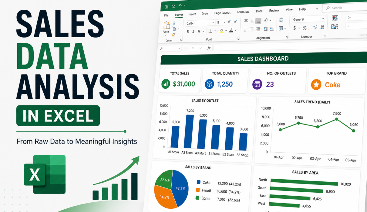
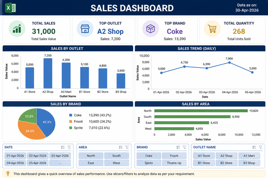
Step 4: Creating a Simple Dashboard
After creating the Pivot Table, the next step I follow is building a simple dashboard.
This is where the data becomes visually clear and easy to understand. A well-designed dashboard is an important part of sales data analysis in Excel because it makes insights easy to understand.
In my daily MIS reports, I don’t overcomplicate dashboards – I keep them clean and focused.
What I Include in My Dashboard
Here are the key elements I usually add:
- Total Sales (KPI)
- Top Performing Outlet
- Top Brand
- Sales Trend (Daily or Monthly)
These 3–4 things are enough to understand overall performance.
Dashboard Layout (Simple Approach)
I usually arrange my dashboard like this:
- Top section → Key numbers (Total Sales, Top Outlet)
- Middle → Charts (Bar chart / Line chart)
- Bottom → Filters (Slicers for Date, Area, Brand)
This layout keeps everything clean and easy to read.
💡 Practical Tip (From Real Work)
One mistake I used to make earlier was adding too many charts.
Now I follow a simple rule:
“If it doesn’t add value, don’t add it”
Clean dashboard = Better understanding
Why Dashboard is Important
From my experience:
- Managers don’t read raw data
- They prefer quick visual insights
- Dashboard helps in faster decision-making
This is why dashboards are used in almost every company. If you are interested in advanced dashboards, you can explore my guide on Power BI developer skills, which is widely used in companies.
Step 5: Extracting Real Business Insights
After creating the dashboard, the next step I focus on is extracting insights.
This is the most important part of data analysis.
Anyone can create charts, but not everyone can explain what the data is actually saying.
How I Analyze Data in My Work
In my daily MIS reporting, I don’t just look at numbers — I try to understand the story behind them.
Here’s how I usually approach it:
- Which area is generating the highest sales?
- Which product is performing the best?
- Which outlets are underperforming?
- Is there any trend in sales over time?
These questions help me convert data into meaningful insights.
Example Insights from This Data
Based on the dashboard, here are some practical insights:
- North region is generating higher sales compared to other areas
- A2 Shop is the top-performing outlet
- Coke is the top-selling brand
- Sales are slightly higher on certain days (possible weekend impact)
These are the type of insights that management actually looks for.
Why Insights Matter
From my experience:
- Raw data = No value
- Dashboard = Good
- Insights = Real value
Decision-makers don’t want data, they want conclusions.
Real Work Scenario
In my job, I often share reports with my manager.
If I only send numbers, it’s not very useful.
But when I add insights like:
- “Sales dropped in West region compared to last week”
- “Top 3 outlets are contributing 60% of total sales”
That’s when the report becomes meaningful.
Pro Tip (Very Powerful)
Always try to answer:
👉 “So what?”
If your data shows something, ask:
- What does it mean?
- What action can be taken?
This is what separates a beginner from a real analyst.
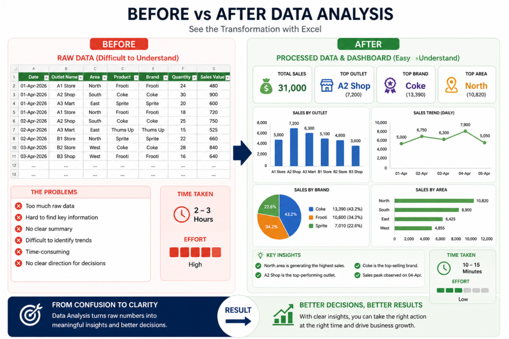
Step 6: Before vs After Analysis
One of the best ways to understand the importance of data analysis is to compare the situation before and after using Excel properly.
| Raw Data | After Analysis |
|---|---|
| Large number of rows | Clean summarized data |
| Difficult to understand | Easy to read dashboard |
| No clear direction | Clear business insights |
| Time-consuming | Quick and efficient |
This is exactly what happens in real work.
My Experience
When I started working, I used to look at raw Excel data and feel confused. It was difficult to understand what was actually happening in the business.
But after learning Pivot Tables and dashboards, everything became clear.
Now instead of spending hours on raw data, I can quickly understand:
- Which outlet is performing best
- Which product needs attention
- Where sales are increasing or decreasing
👉 This transformation is the real power of Excel.
Why This Matters
From my experience:
- Raw data only shows numbers
- Analysis shows meaning
- Dashboard shows direction
And decision-making becomes much faster.
My Real Experience with Sales Data Analysis
When I started working as an MIS Executive, handling sales data was not easy for me.
Every day I used to receive raw data from multiple outlets, and honestly, it looked very confusing at first. There were too many rows, and it was difficult to understand what was actually happening in the business.
Initially, I used to spend a lot of time just organizing the data. Sometimes it used to take 2–3 hours to prepare a proper report.
How Things Changed Over Time
After learning how to use Pivot Tables and dashboards properly, my workflow completely changed.
Now my process looks like this:
- Clean the data quickly
- Create a Pivot Table
- Build a simple dashboard
- Extract key insights
This entire process now takes me around 20–30 minutes instead of hours.
What I Learned from This
From my experience, I realized one important thing:
It’s not about how much data you have, it’s about how you analyze it.
Even simple tools like Excel can give powerful insights if used correctly.
Real Work Impact
In my job, this approach has helped me:
- Prepare reports faster
- Reduce manual errors
- Provide better insights to my manager
- Improve overall reporting quality
Because of this, my work became more efficient and valuable.
Advice for Beginners
If you are just starting:
- Don’t feel overwhelmed by raw data
- Focus on learning basics like Pivot Tables
- Practice with real datasets
- Keep your dashboards simple
Once you understand the process, everything becomes easier.
Common Mistakes to Avoid in Sales Data Analysis
From my experience, many beginners make small mistakes that can completely affect the accuracy of their analysis.
I also made some of these mistakes when I started.
1. Skipping Data Cleaning
Many people directly start creating Pivot Tables without cleaning the data.
This leads to:
- Wrong totals
- Duplicate values
- Incorrect insights
2. Using Wrong Pivot Setup
If you place fields incorrectly in Pivot Table:
- Data summary becomes confusing
- You may misinterpret results
Always double-check:
- Rows
- Values
- Filters
3. Overcomplicating the Dashboard
Adding too many charts and visuals can make the dashboard confusing.
From my experience:
Simple dashboards work better than complex ones.
4. Ignoring Insights
Some people stop after creating charts.
But charts alone are not enough.
You must explain:
- What is happening
- Why it is happening
- What action should be taken
5. Not Validating Data
If your data has errors:
Your entire analysis becomes unreliable
Always verify:
- Numbers
- Totals
- Data consistency
My Advice
From my learning:
Focus on accuracy first, then visualization
Because:
- Wrong data = Wrong decisions
- Clean data = Correct insights
Pro Tips for Better Sales Data Analysis in Excel
Over time, while working on real MIS reports, I’ve learned a few practical tricks that make data analysis faster and more effective.
These are simple but very useful in daily work.
1. Always Convert Data into Table (Ctrl + T)
This is one of the most important habits I follow.
Benefits:
- Easy filtering
- Structured format
- Automatically expands when new data is added
2. Keep Dashboard Simple and Clean
Earlier, I used to add too many charts.
But now I follow a simple rule:
“Less is more”
- Use only important charts
- Avoid unnecessary colors
- Focus on clarity
3. Use Slicers for Better Filtering
Slicers make dashboards interactive.
You can filter data by:
- Date
- Area
- Brand
This helps in quick analysis during meetings.
4. Focus on Business Questions
Instead of just looking at numbers, ask:
- Which outlet is performing best?
- Where is sales dropping?
- Which product needs attention?
This improves your thinking as a data analyst.
5. Always Cross-Check Your Results
Before sharing any report:
👉 Verify:
- Total sales
- Pivot calculations
- Data accuracy
This avoids mistakes and builds trust.
Final Thoughts
Sales data analysis in Excel is one of the most valuable skills for anyone working in MIS, reporting, or data-related roles.
From my experience, you don’t need advanced tools to start – Excel itself is powerful enough if used properly.
Mastering sales data analysis in Excel can significantly improve your reporting and data analysis skills.
The key is simple:
- Clean your data
- Structure it properly
- Use Pivot Tables
- Build a simple dashboard
- Extract meaningful insights
Once you follow this process, even large datasets become easy to handle. If your goal is to become a data analyst, I highly recommend following this complete data analyst career roadmap.
What You Should Do Next
If you want to improve your skills:
- Practice with real datasets
- Try creating your own dashboards
- Focus on understanding insights
- Learn step by step (don’t rush)
Consistency is the key.
📊 Download Practice Dashboard Template
This is a simple practice dashboard template that you can use to understand how sales data is structured, analyzed, and presented in Excel. It’s perfect for beginners who want hands-on experience with real reporting concepts.
Download Practice TemplateIf you are serious about becoming a Data Analyst or improving your Excel skills, start practicing with real data.
👉 Don’t just learn — apply.
Because in real work:
Understanding data is more important than just working on it.
If you want to see how data analysis works in real scenarios, check my customer segmentation Excel project where I analyzed customer behavior using real data.
Frequently Asked Questions
Clear answers to common questions about sales data analysis in Excel, pivot tables, dashboards, and real-world MIS reporting.
What is sales data analysis in Excel?
Sales data analysis in Excel means converting raw sales data into meaningful insights using tools like Pivot Tables, charts, and dashboards. It helps businesses understand performance and make better decisions.
Is Excel enough for data analysis?
Yes, Excel is more than enough for beginner to intermediate data analysis. Many companies still use Excel for MIS reporting, dashboards, and performance tracking.
Why is data cleaning important in Excel?
Data cleaning ensures your analysis is accurate. If your data contains errors, duplicates, or inconsistencies, your insights will be wrong and can lead to poor decisions.
What is the use of Pivot Tables in Excel?
Pivot Tables are used to summarize large datasets quickly. They help analyze data by categories like outlet, product, or area and generate reports in seconds.
How can I create a dashboard in Excel?
You can create a dashboard by using Pivot Tables, charts, and slicers. Start with summarizing your data, then visualize key metrics like total sales, top products, and trends.
What skills are required for sales data analysis?
Important skills include Excel basics, Pivot Tables, data cleaning, dashboard creation, and analytical thinking. These skills are essential for MIS and data analyst roles.
How can beginners practice data analysis in Excel?
Beginners should practice using sample datasets, build small dashboards, and work on real-life scenarios like sales reports. Regular practice improves understanding quickly.

1 Comment