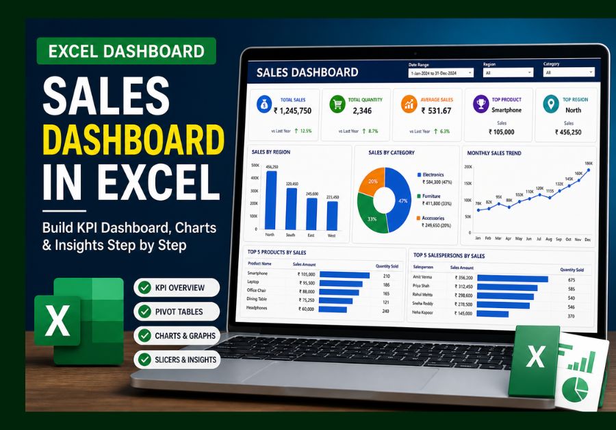
Introduction
A sales dashboard in Excel is one of the most useful reporting tools for MIS executives, data analysts, sales teams, and business owners. In every company, sales data is generated daily, but raw data alone does not help much unless it is converted into clear insights.
In real business work, decision-makers usually do not have time to check thousands of rows in Excel. They want a quick view of revenue, quantity, top products, region-wise performance, monthly trends, and growth. This is where a dashboard becomes powerful.
In this Real Data Lab project, I worked on a practical sales dataset and converted it into a clean dashboard using Excel. The main goal was to analyze sales performance, identify important KPIs, and understand what actions can be taken based on the data.
This is the same type of reporting I use in my daily MIS reporting work in Excel, where raw sales data is transformed into clear business insights.
Let’s start by understanding the dataset used in this project.
Dataset Overview
The dataset used in this project represents a common sales reporting structure. This type of data is often used in FMCG companies, retail stores, distribution businesses, and sales MIS reporting.
The dataset includes the following columns:
- Date
- Invoice Number
- Region
- Salesperson
- Product Name
- Product Category
- Quantity Sold
- Sales Amount
- Discount
- Net Sales
This dataset is ideal for building a sales dashboard in Excel because it contains both transactional data and business performance fields.
If you are new to Excel, you can first learn the basics from my Excel data analysis guide to build a strong foundation.
From my experience, this is the kind of data many MIS teams receive daily or weekly. At first, it may look like a normal Excel sheet, but once cleaned and summarized properly, it can reveal strong business insights.
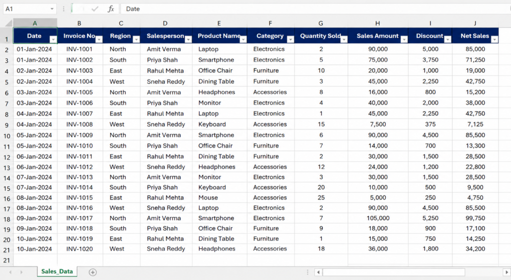
Sample sales dataset used for building the Excel dashboard
If you are new to Excel, you can first learn the basics from my guide on essential Excel skills for data analysis.
Step-by-Step Process to Build a Sales Dashboard in Excel
Step 1: Data Cleaning and Preparation
Before building any dashboard, the first step is data cleaning. A dashboard is only as accurate as the data behind it. If the raw data has errors, duplicates, wrong formats, or missing values, the final dashboard will show misleading results.
In this project, I started by checking the dataset carefully.
The cleaning process included:
- Removing duplicate invoice entries
- Checking blank cells in important columns
- Standardizing region and product names
- Converting date values into proper date format
- Ensuring sales amount and quantity columns are numeric
- Removing unnecessary spaces from text fields
This step may look simple, but in real MIS work, it is one of the most important parts of reporting. Many times, small mistakes like duplicate rows or incorrect date formats can change the entire result.
For example, if one invoice is repeated twice, total sales will be overstated. If date format is wrong, monthly trend analysis will not work properly. If product names are inconsistent, Pivot Tables may show the same product as different items.
That is why I always treat data cleaning as the foundation of dashboard reporting.
Step 2: Creating Key Performance Indicators
KPIs are the heart of any dashboard. A sales dashboard in Excel should not only show charts; it should quickly answer important business questions.
In this project, I created the following KPIs:
Total Sales
Total sales shows the overall revenue generated during the selected period. This is usually the first metric management wants to see.
Total Quantity Sold
This helps understand product movement. Sometimes revenue may be high, but quantity may be low due to high-value products. Quantity analysis gives a different view of performance.
Average Sales Value
Average sales value helps understand the average revenue generated per transaction or product. It is useful for comparing performance across regions or salespersons.
Top Performing Product
This KPI identifies the product contributing the highest revenue. Businesses can use this insight for stock planning, promotions, and sales strategy.
Top Performing Region
This shows which region is generating the highest revenue. It helps management understand where the business is performing well.
Sales Growth Trend
Growth trend helps compare performance across months. It shows whether sales are increasing, decreasing, or remaining stable.
These KPIs form the foundation of a sales dashboard in Excel and help decision-makers quickly understand business performance.
You can explore Excel functions and formulas in detail from Microsoft Excel official documentation.
| KPI | Purpose | Business Use |
|---|---|---|
| Total Sales | Shows overall revenue | Performance tracking |
| Quantity Sold | Tracks product movement | Inventory planning |
| Top Product | Identifies best seller | Promotion strategy |
| Region Sales | Compares regions | Regional planning |
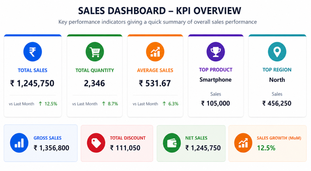
KPI cards created to summarize sales performance in Excel
Step 3: Pivot Table Analysis
After cleaning the data and identifying KPIs, the next step was to summarize the data using Pivot Tables.
Pivot Tables are one of the most powerful features in Excel because they help convert large datasets into meaningful summaries within seconds.
For this dashboard, I created Pivot Tables for:
- Sales by Region
- Sales by Product
- Sales by Category
- Monthly Sales Trend
- Salesperson Performance
- Quantity Sold by Product
These summaries helped me understand the data from different angles.
For example, region-wise sales helped identify which area performed best. Product-wise sales showed which items contributed more revenue. Monthly trends helped identify growth or decline patterns.
Without Pivot Tables, analyzing this data manually would take a lot of time. But with Pivot Tables, the same analysis becomes faster, cleaner, and more reliable.
This is why every beginner who wants to work in MIS or data analysis should learn Pivot Tables properly.
If you are not familiar with Pivot Tables, check my detailed guide on how to use Excel features effectively to improve your reporting skills.
Step 4: Dashboard Creation in Excel
After preparing Pivot Tables, I created the final dashboard layout.
A good dashboard should be simple, clean, and easy to understand. It should not look overloaded with too many charts or colors. The goal is not decoration; the goal is decision-making.
The dashboard included:
- KPI cards at the top
- Region-wise sales bar chart
- Product category pie chart
- Monthly sales trend line chart
- Top products table
- Slicers for region and category filtering
The KPI cards were placed at the top because they give an instant overview. Charts were placed below to explain the data visually. Slicers were added so users can filter the dashboard without changing formulas.
This makes the dashboard interactive and useful.
Raw data creates confusion, but a dashboard creates clarity.
Decision-makers rarely read raw Excel sheets. They rely on dashboards because dashboards show the most important information in one place.
After building the dashboard, the final output looks like this:
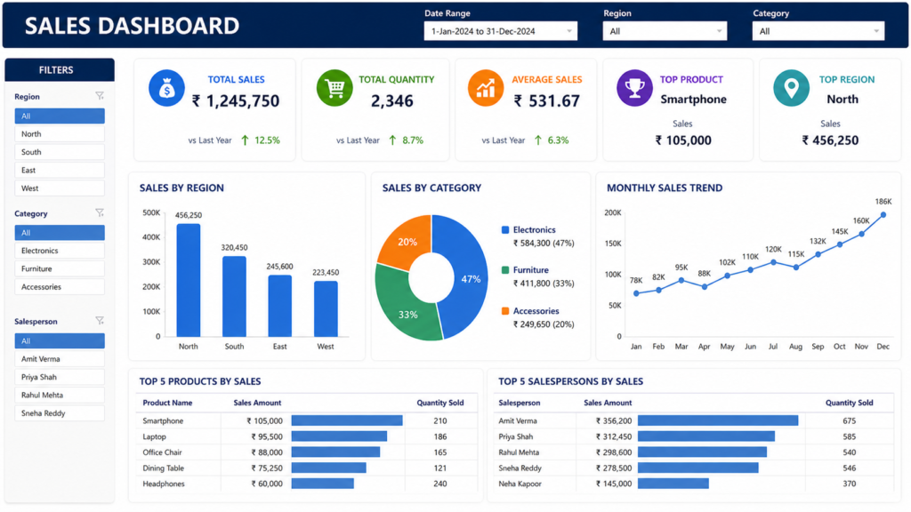
Final Excel sales dashboard showing KPIs, charts, and performance insights
How I Designed This Dashboard
In real-world scenarios, building a dashboard is not just about creating charts. It follows a structured workflow.
First, I defined the purpose of the dashboard. The main objective was to track sales performance, identify top-performing products, compare regions, and understand monthly trends.
Next, I cleaned the dataset and prepared it for analysis. This step ensured that the dashboard would show accurate numbers.
After that, I created Pivot Tables to summarize the data by region, product, category, and month.
Then, I designed the dashboard layout. I placed KPIs at the top, visual charts in the middle, and filters on the side.
Finally, I tested the dashboard by applying filters and checking whether all charts and KPIs changed correctly.
This process helped ensure that the dashboard was not only visually clean but also useful for decision-making.
Dashboard Flow
A clean dashboard follows this structured workflow:
This flow is important because skipping any step can reduce the quality of the final output. If the raw data is not cleaned, Pivot Tables may show incorrect results. If Pivot Tables are not structured properly, charts may become confusing. If insights are not written clearly, the dashboard will not help decision-makers.
That is why dashboard building is both a technical and analytical skill.
📥 Download Dataset & Dashboard
You can download the dataset and Excel dashboard used in this Real Data Lab project and practice it on your own.
Download FilesKey Insights from This Sales Dashboard
Once the dashboard was ready, the next step was to extract meaningful insights from the data.
Below is a visual representation of the key insights derived from the sales dashboard:
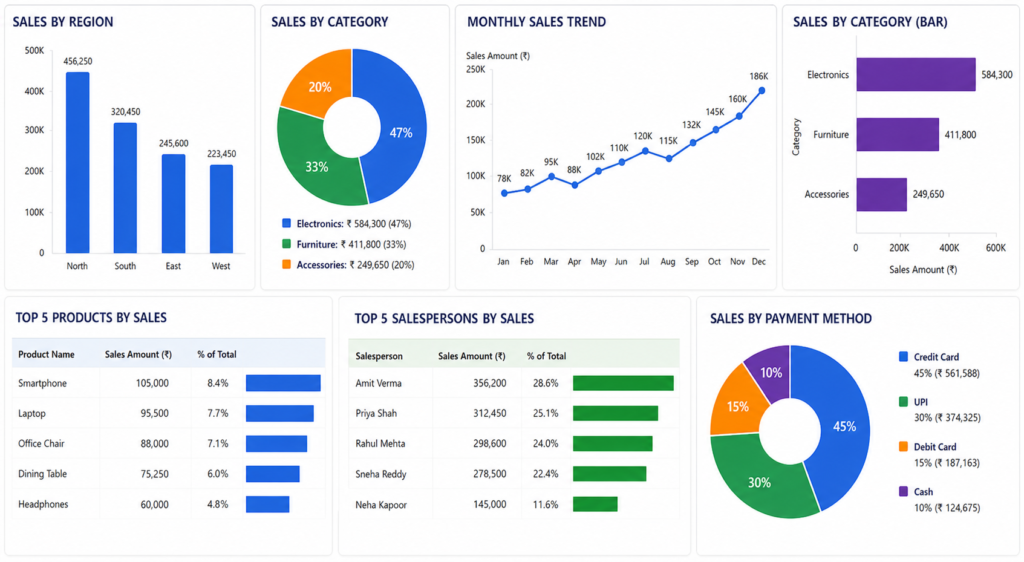
Sales dashboard insights showing region performance, category distribution, and monthly sales trends
1. Top Region Generates Maximum Revenue
The dashboard showed that one or two regions contributed a major share of total sales. This is useful because management can focus on maintaining strong performance in those regions.
At the same time, low-performing regions can be reviewed separately to understand the reason behind weak sales.
2. Few Products Drive Majority Sales
The product analysis showed that a small number of products contributed a large portion of revenue. This is common in many businesses.
This insight helps with stock planning, promotional strategy, and product focus.
3. Monthly Trend Shows Sales Pattern
The monthly trend chart helped identify whether sales were increasing, decreasing, or fluctuating.
This type of trend analysis is useful for planning inventory, targets, and business strategy.
4. Some Categories Need Improvement
Category-wise performance showed that some product categories performed better than others.
This insight helps businesses understand where they should focus more effort.
Best Practices for Building Excel Dashboards
Creating a dashboard is not just about adding charts. A good dashboard should be clean, useful, and easy to understand.
Some best practices I follow are:
- Keep the layout simple
- Use only important KPIs
- Avoid too many colors
- Use clear chart titles
- Keep filters easy to use
- Validate dashboard numbers
- Avoid unnecessary decoration
- Add insights below the dashboard
A good dashboard should answer business questions quickly. If a user has to spend too much time understanding the dashboard, the design needs improvement.
The main goal is clarity.
How Businesses Use Sales Dashboards
Sales dashboards are widely used in real business environments.
Companies use dashboards for:
- Daily sales tracking
- Monthly performance review
- Region-wise comparison
- Product performance analysis
- Salesperson tracking
- Target monitoring
- Inventory planning
- Business decision-making
For example, if a region is underperforming, management can check whether the issue is related to stock, sales effort, customer demand, or pricing.
If a product is performing very well, the company can increase stock availability and run focused promotions.
This is why a sales dashboard in Excel is not just a reporting tool. It is a business decision tool.
Real-World Example of Sales Dashboard Use
Imagine a retail or FMCG company reviewing monthly sales performance.
After checking the dashboard, the team finds that:
- North region has the highest sales
- South region is below target
- One product category is growing fast
- Two products are not moving well
- Sales increased during the last week of the month
Based on these insights, the company can take action.
They may send more stock to the high-performing region, run offers in the low-performing region, focus on fast-moving products, and investigate why some products are not selling.
This is exactly how sales data supports real business decisions.
Why This Project Is Important for Your Career
If you are learning data analysis or MIS reporting, this project is highly valuable.
A dashboard project shows that you understand:
- Data cleaning
- Pivot Tables
- KPI creation
- Chart design
- Business insights
- Reporting structure
This type of project can also be added to your resume or portfolio.
In interviews, you may be asked:
“Have you created any dashboard project?”
You can explain this project confidently by saying that you cleaned sales data, created Pivot Tables, built KPIs, designed a dashboard, and extracted insights.
That is much stronger than only saying, “I know Excel.”
If you are planning to switch into analytics, follow this complete data analyst career roadmap to understand the required skills.
Common Mistakes in Sales Dashboard Creation
Many beginners create dashboards that look attractive but are not useful. A dashboard should not only look good; it should help users make decisions.
Common mistakes include:
- Using too many charts
- Not cleaning data properly
- Choosing wrong KPIs
- Using confusing colors
- Not adding slicers or filters
- Ignoring business insights
- Making the dashboard too crowded
- Not checking formulas and totals
Avoiding these mistakes helps you create dashboards that are both professional and useful.
What Should You Do Next?
Now that you understand how a sales dashboard is built, the next step is practice.
You can start by:
- Downloading sample sales datasets
- Creating Pivot Tables
- Building KPI cards
- Designing simple dashboards
- Practicing with slicers
- Writing insights from your dashboard
The more dashboards you build, the better your confidence will become.
Dashboard creation is not learned by theory alone. You need to practice with real data.
Tools You Can Use Beyond Excel
Excel is a powerful tool, especially for beginners and MIS professionals. But as you grow in data analysis, you should also explore other tools.
Useful tools include:
- Power BI for interactive dashboards
- Tableau for advanced data visualization
- SQL for querying large datasets
- Python for advanced data analysis
- Google Looker Studio for web-based reports
Learning these tools along with Excel will improve your career opportunities and help you handle larger datasets.
Before we conclude, remember that the value of any dashboard lies in the actions taken based on its insights.
🚀 Want to Practice This Sales Dashboard?
If you want to improve your Excel reporting skills and start thinking like a real data analyst, practice with the dataset and dashboard used in this Real Data Lab project.
Try changing filters, checking KPIs, and reading the insights like a real MIS or data analyst.
Download Dataset & DashboardYou can also practice with real-world datasets available on Kaggle datasets.
📊 Quick Summary
- Clean and structured sales data is the foundation of accurate reporting
- KPIs provide a quick overview of business performance
- Pivot Tables simplify large datasets into meaningful summaries
- Dashboards help decision-makers take faster actions
- Insights are the most important outcome of data analysis
Conclusion
A sales dashboard in Excel is not just a reporting file. It is a practical decision-making tool used in real business environments.
In this Real Data Lab project, we converted raw sales data into meaningful insights using data cleaning, KPIs, Pivot Tables, charts, slicers, and dashboard design.
This type of project is highly valuable for MIS executives, Excel learners, and data analyst aspirants because it shows practical business reporting skills.
If you want to grow in data analytics, start building real dashboard projects like this. Theory is useful, but real projects make you job-ready.
You can also explore my customer segmentation Excel project to understand how raw data can be analyzed for business insights.
Frequently Asked Questions
Clear answers to common questions about sales dashboards in Excel, KPIs, Pivot Tables, and real-world MIS reporting.
What is a sales dashboard in Excel?
A sales dashboard in Excel is a visual report that shows important sales metrics such as total sales, quantity, top products, regional performance, and monthly trends using charts, KPIs, Pivot Tables, and slicers.
Which Excel tools are used to build a sales dashboard?
The most commonly used Excel tools are Pivot Tables, Pivot Charts, formulas, slicers, conditional formatting, and basic chart types like bar charts, line charts, and pie charts.
Is Excel enough for sales dashboard creation?
Yes, Excel is enough for basic to intermediate sales dashboards. Many companies still use Excel for MIS reporting, sales tracking, and business performance dashboards.
What KPIs should a sales dashboard include?
A good sales dashboard should include KPIs like total sales, quantity sold, average sales value, top product, top region, category performance, and monthly sales trend.
Can I add this dashboard project to my resume?
Yes, this type of dashboard project is useful for resumes because it shows practical skills in data cleaning, Excel reporting, KPI creation, Pivot Tables, and business insight generation.
How can beginners practice sales dashboard projects?
Beginners can practice by downloading sample sales datasets, cleaning the data, creating Pivot Tables, designing KPI cards, building charts, and writing insights from the dashboard.