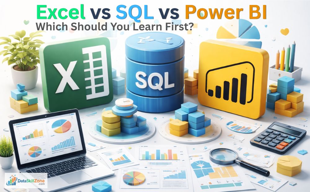
Introduction
If you are planning to build a career in data analytics, you have probably asked this question multiple times:
“Should I learn Excel, SQL, or Power BI first?”
This confusion is very common among beginners.
When you search online, you will find different opinions. Some people say Excel is enough to start, while others recommend learning SQL or jumping directly into Power BI.
The problem is that most articles explain these tools theoretically. They tell you what each tool does, but they don’t explain how these tools are actually used in real jobs.
You can follow a structured roadmap in our detailed article on how to become a data analyst step by step.
In this guide, I will break down Excel vs SQL vs Power BI based on my real experience working as an MIS Executive.
Instead of theory, you will learn how these tools are used in a real business workflow – from raw data to final dashboard.
After reading this article, you will clearly understand:
- The real difference between Excel, SQL, and Power BI
- Where each tool is used in a job
- Which tool you should learn first
- How to become job-ready step by step
In this guide on Excel vs SQL vs Power BI, we will compare these tools based on real job use cases.
Excel is best for spreadsheets, quick analysis, and everyday reporting. SQL is best for extracting and managing large datasets from databases. Power BI is best for dashboards, data visualization, and interactive business reports. Most beginners should start with Excel, then learn SQL, and finally move to Power BI for complete data career growth.
My Role as an MIS Executive (Real Experience)
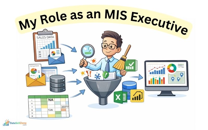
Before comparing Excel, SQL, and Power BI, it is important to understand how these tools are actually used in a real job environment.
Based on my experience as an MIS Executive, I will explain the practical workflow that happens in most companies.
In my role, I mainly work with sales and operational data that comes from multiple sources. This data is not always clean or ready to use, which makes the job more practical than theoretical.
📊 Types of Data I Handle Daily
On a typical day, I deal with different types of data such as:
- Raw sales data from multiple regions
- Reports shared by different teams
- Data extracted from internal systems or software
- Excel files with inconsistent formats and missing values
Most of this data is unorganized and requires proper cleaning before it can be used for analysis.
My Key Responsibilities
My daily work involves multiple steps, and each step plays an important role in business decision-making:
- Data Cleaning:
Removing duplicates, fixing errors, and standardizing formats - Data Structuring:
Converting raw data into a proper format for reporting - Data Analysis:
Identifying trends such as top-performing products, low-performing regions, and sales growth - Report Creation:
Preparing daily, weekly, and monthly MIS reports - Insight Presentation:
Sharing clear insights with management to support decision-making
For example, I receive daily sales data from different regions. This data may have duplicate entries or incorrect formatting. I first clean and organize it, then create a structured report showing:
- Region-wise sales performance
- Product-wise contribution
- Daily revenue trends
This helps managers quickly understand the business situation and take action.
Tools I Use in This Process
To complete all these tasks efficiently, I use a combination of tools:
- 👉 Excel for data cleaning and quick analysis
- 👉 SQL for extracting and handling large datasets
- 👉 Power BI for creating dashboards and visual reports
Each tool has a specific role in the workflow.
A real understanding of Excel vs SQL vs Power BI comes from seeing how companies use them together.
Understanding how and when to use them is the key to becoming a successful data analyst in any organization.
📊Excel in Real Jobs (Foundation Tool)
Excel is the first tool every data analyst should learn. It is simple, powerful, and widely used across industries. Excel is widely used across industries, and you can explore its official features on the Microsoft website.
Even in companies that use advanced tools, Excel is still used daily. If you want to master Excel from basic to advanced level, you can read our complete guide on Excel skills for data analysts.
1. Data Cleaning (With Real Excel Examples)
In real jobs, data cleaning is not just theory – it is something you do daily using actual Excel formulas and tools.
Let me show you exactly how I handle this in my work.
Common Data Issues I Face
When I receive raw sales data, it usually contains:
- Extra spaces in product names (e.g., ” Laptop ” instead of “Laptop”)
- Missing values in columns like Region or Sales
- Duplicate rows due to multiple data entries
- Dates in different formats (e.g., 01-01-2025 vs 1/1/25)
If I directly use this data for reporting, the results will be wrong. So cleaning is the first step.
Real Excel Functions I Use
1. TRIM Function (Remove Extra Spaces)
Syntax:
=TRIM(A2)
Example:
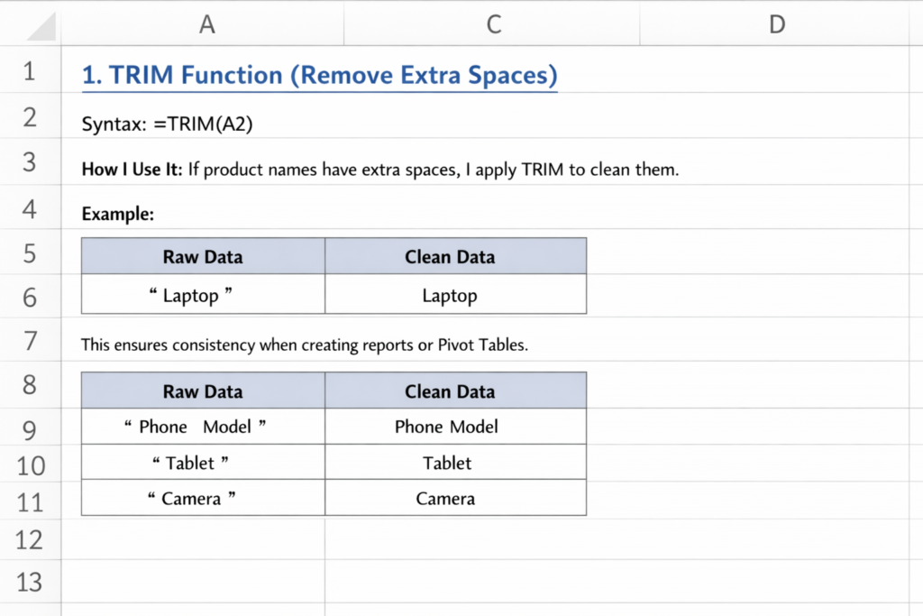
This ensures consistency when creating reports or Pivot Tables.
2. IF Function (Handle Missing Values)
Syntax:
=IF(A2=””, “Not Available”, A2)
How I Use It:
If a cell is empty, I replace it with a meaningful value.
Example:
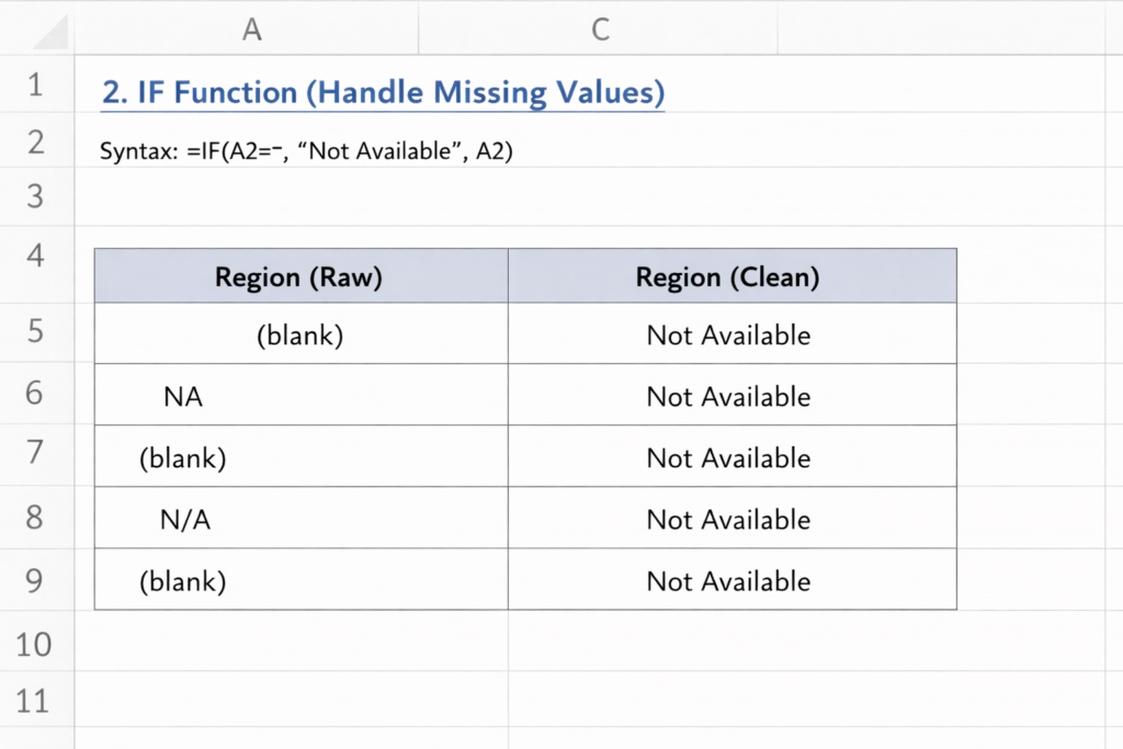
This avoids errors during analysis.
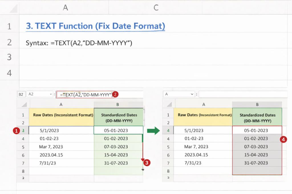
3. TEXT Function (Fix Date Format)
Syntax:
=TEXT(A2,”DD-MM-YYYY”)
How I Use It:
When dates are inconsistent, I standardize them. This helps when creating monthly reports.
4. Remove Duplicates Tool
Steps I Follow:
- Select data
- Go to Data → Remove Duplicates
- Choose columns
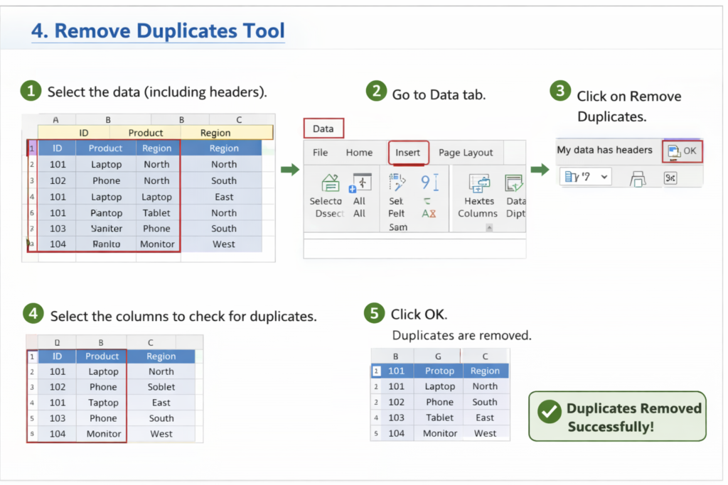
This removes repeated records instantly.
Real Example from My Job
For example, I receive a daily sales file where:
- Product names have extra spaces
- Some regions are missing
- Duplicate entries exist
My process:
- Use TRIM to clean product names
- Apply IF formula to fill missing values
- Remove duplicates using Excel tool
- Standardize dates using TEXT
After cleaning, the dataset becomes reliable, and I can confidently use it for Pivot Tables and reporting.
2. Data Analysis Using Formulas (With Real Excel Examples)
After cleaning the data, the next step in my daily work is data analysis.
This is where Excel formulas play a very important role. Instead of manually calculating values, I use formulas to quickly generate insights from the data.
In my MIS role, I frequently use formulas like SUMIFS, COUNTIFS, and XLOOKUP to analyze sales performance, track products, and understand customer behavior.
Real-World Excel Formulas I Use (With Syntax & Examples)
1. SUMIFS (Calculate Sales Totals Based on Conditions)
Syntax:
=SUMIFS(sum_range, criteria_range1, criteria1)
How I Use It:
I use SUMIFS to calculate total sales for a specific region or product.
Example:
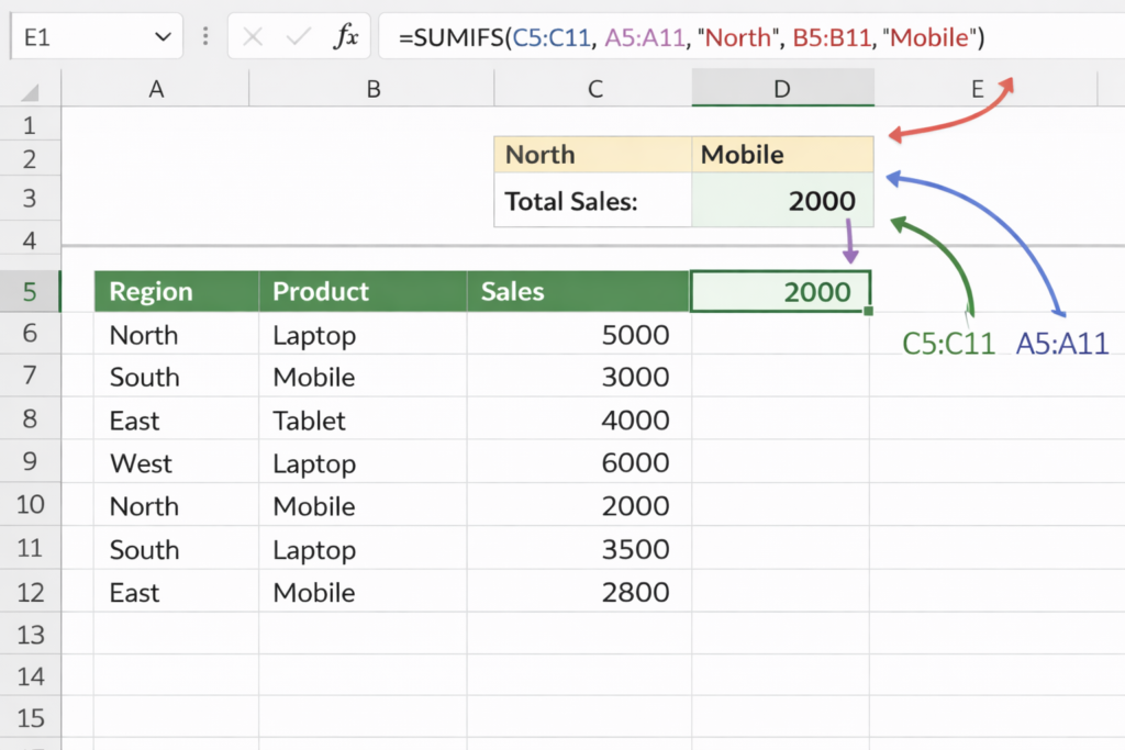
If I want to calculate total sales for North region:
=SUMIFS(C2:C4, A2:A4, “North”)
👉 Output = 7000
This helps me quickly analyze region-wise performance without creating manual reports.
2. COUNTIFS (Count Data Based on Conditions)
Syntax:
=COUNTIFS(criteria_range1, criteria1)
How I Use It:
I use COUNTIFS to count how many times a specific condition is met.
Example:
👉 Count how many sales happened in North region:
=COUNTIFS(A2:A4, “North”)
👉 Output = 2
This is useful when analyzing the number of transactions or orders.
3. XLOOKUP (Fetch Data from Another Table)
Syntax:
=XLOOKUP(lookup_value, lookup_array, return_array)
How I Use It:
I use XLOOKUP to match data from different sheets.
Example:
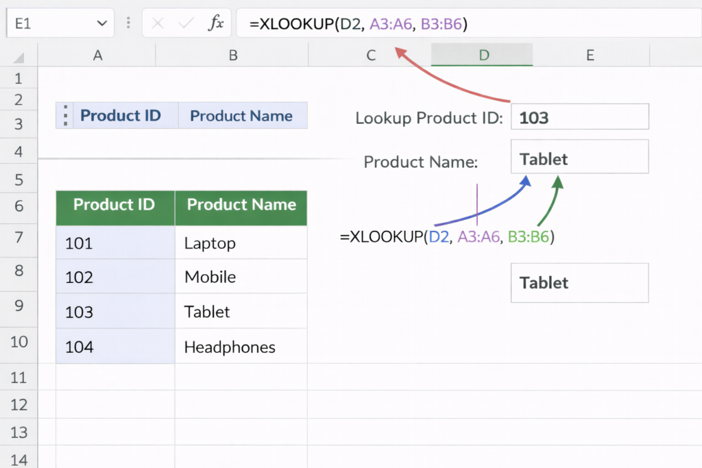
👉 If I have Product ID and want Product Name:
=XLOOKUP(A2, Sheet2!A:A, Sheet2!B:B)
This helps me combine data from multiple sources quickly.
Real Example from My Job
In my daily reporting work:
- I use SUMIFS to calculate total sales by region and product
- I use COUNTIFS to count number of orders
- I use XLOOKUP to fetch product details from master data
For example, when preparing a sales report, I can instantly answer:
- Which region generated highest revenue
- How many orders were placed
- Which products are performing best
3. Pivot Tables (Most Important Feature in Excel)
Pivot Tables are one of the most powerful tools in Excel, and in my daily MIS work, they are used almost every day.
Instead of writing multiple formulas or creating manual summaries, Pivot Tables allow me to quickly analyze large datasets and generate meaningful reports within minutes.
A Pivot Table is used to summarize large data into a structured format.
It helps you convert raw data into insights like totals, counts, and comparisons without complex formulas.
Real Use Cases from My Job
In my daily reporting work, I use Pivot Tables to create:
- Region-wise sales reports
- Product-wise performance analysis
- Monthly and daily summaries
- Top-performing vs low-performing products
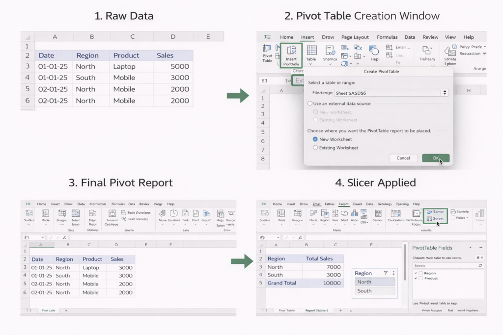
Step-by-Step: How I Use Pivot Table
Let’s take a simple real example.
📁 Sample Data:
| Date | Region | Product | Sales |
| 01-01-25 | North | Laptop | 5000 |
| 01-01-25 | South | Mobile | 3000 |
| 02-01-25 | North | Mobile | 2000 |
👉 Steps I Follow:
- Select the entire dataset
- Go to Insert → Pivot Table
- Choose “New Worksheet”
- Drag fields:
- Region → Rows
- Sales → Values
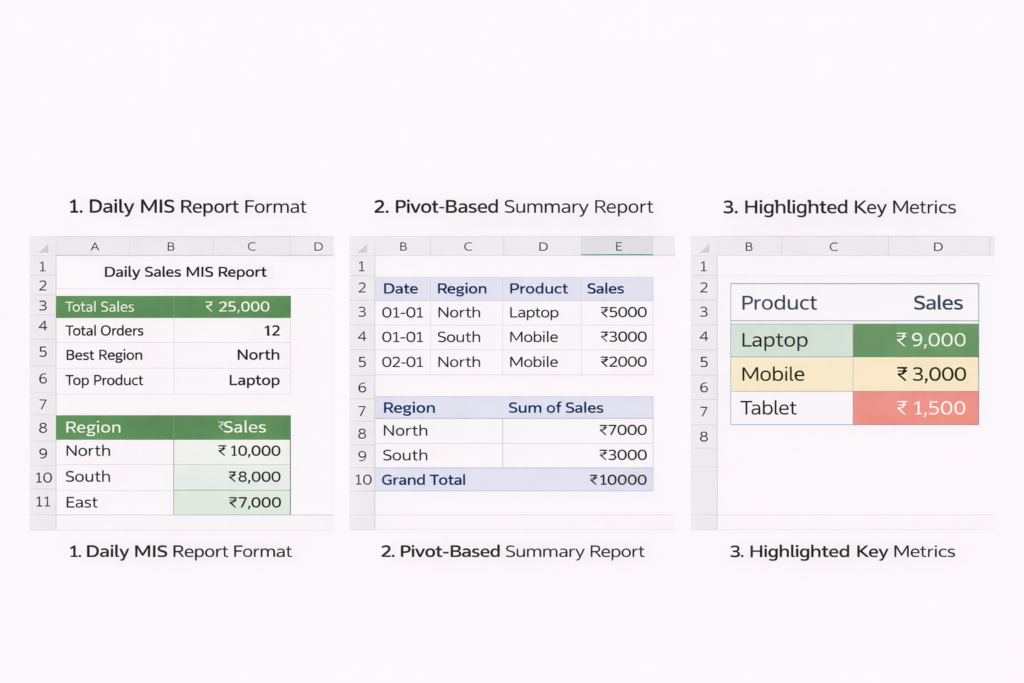
📈 Output (Region-wise Sales)
| Region | Total Sales |
| North | 7000 |
| South | 3000 |
Within seconds, I get a summary without writing any formula.
Advanced Use in My Work
I don’t just stop at basic Pivot Tables. I also:
- Add Product in Columns → for detailed comparison
- Use Filters → to analyze specific dates or regions
- Insert Slicers → for interactive reports
- Convert Pivot Table into charts → for dashboards
Real Example from My Job
Every day, I receive sales data from different regions. Instead of manually calculating totals, I use Pivot Tables to instantly find:
- Which region has highest sales
- Which product is underperforming
- Daily and monthly revenue trends
This helps management quickly understand business performance and take decisions.
That’s why Pivot Tables are considered the most important Excel skill for any data analyst or MIS Executive.
4. Quick Reporting (Daily MIS Work in Excel)
Managers and team leaders do not have time to go through raw data. They need quick and clear insights to make decisions.
This is where Excel plays a major role in quick reporting.
In my role as an MIS Executive, I use Excel daily to create reports that summarize large amounts of data into simple and understandable formats.
Types of Reports I Create
Using Excel, I regularly prepare different types of reports such as:
- Daily MIS Reports:
Track daily sales, performance, and targets - Weekly Summaries:
Analyze trends and compare performance over the week - Ad-hoc Reports:
Special reports requested by management for specific analysis
How I Create Quick Reports in Excel
Instead of starting from scratch every time, I use a structured approach:
- Clean the data using formulas (TRIM, IF, etc.)
- Use Pivot Tables to summarize data quickly
- Apply formulas like SUMIFS for specific calculations
- Format the report using:
- Bold headings
- Conditional formatting
- Proper alignment
Every morning, I prepare a Daily Sales MIS Report. The report includes:
- Total sales for the day
- Region-wise performance
- Product-wise breakdown
For example, I use a Pivot Table to quickly generate region-wise sales and then apply formatting to make the report easy to read.
Sometimes, managers ask questions like:
- “Which region performed best today?”
- “Which product is declining in sales?”
Instead of manually checking data, I can answer these questions within minutes using Excel reports.
Why Excel is Perfect for Quick Reporting
- Fast and easy to use
- No need for complex setup
- Ideal for immediate insights
- Widely used in all companies
This is why Excel remains one of the most important tools for quick reporting in real jobs, especially for MIS Executives and data analysts.
Real Example from My Job (Complete Workflow in Excel)
To better understand how Excel is used in real work, let me walk you through my actual daily workflow as an MIS Executive.
Every morning, I receive raw sales data from multiple regions. This data usually comes in Excel format, but it is not ready for direct use.
It often contains issues like duplicate entries, missing values, and inconsistent formatting.
🔄 Step-by-Step Process I Follow
1. Data Cleaning
The first step is to clean the data to make it usable.
- I use TRIM to remove extra spaces in product or region names
- Apply IF formulas to handle missing values
- Use Remove Duplicates to eliminate repeated records
- Standardize date formats using the TEXT function
This ensures the dataset is accurate and consistent.
2. Applying Formulas for Analysis
Once the data is clean, I start analyzing it using formulas.
- Use SUMIFS to calculate total sales by region or product
- Use COUNTIFS to count number of transactions
- Use XLOOKUP to fetch product or customer details from master data
This helps me quickly extract meaningful insights from raw data.
3. Creating Pivot Tables
After basic analysis, I create Pivot Tables to summarize the data.
- Region-wise sales summary
- Product-wise performance
- Daily or monthly trends
This step converts raw data into structured insights.
4. Generating Final Report
Finally, I prepare a clean and professional MIS report.
- Format the report with headings and highlights
- Add key metrics like total sales and growth
- Make it easy for managers to understand
⏱️ Time Taken
This entire process – from raw data to final report – is usually completed within 1 to 2 hours, depending on the data size.
Why This Process Matters
By following this structured workflow:
- Data becomes accurate and reliable
- Reports are generated quickly
- Management gets clear insights for decision-making
This is how Excel is practically used in real jobs, not just for learning but for solving actual business problems.
🗄️SQL in Real Jobs (Handling Large Data)
Excel works well for small to medium data. But when data becomes large, Excel is not enough.
This is where SQL comes in. If you are new to data analytics, you should also check our detailed guide on SQL for beginners to understand how data is actually handled in real systems.
1. Extracting Data from Database (Using SQL in Real Jobs)
In most companies, data is not stored in Excel files. Instead, it is stored in databases like MySQL, SQL Server, or PostgreSQL.
Excel is mainly used for reporting, but the actual raw data is maintained in databases.
This is where SQL becomes an essential skill.
In my workflow, SQL is used to extract the exact data I need before moving it into Excel or Power BI for further analysis.
What SQL Helps Me Do
Using SQL, I can:
- Fetch data from large databases
- Filter data based on specific conditions
- Customize queries to get only relevant information
- Avoid downloading unnecessary large files
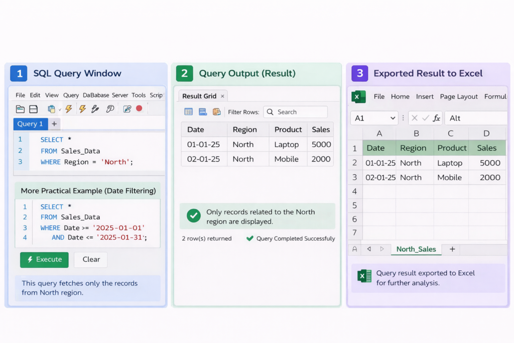
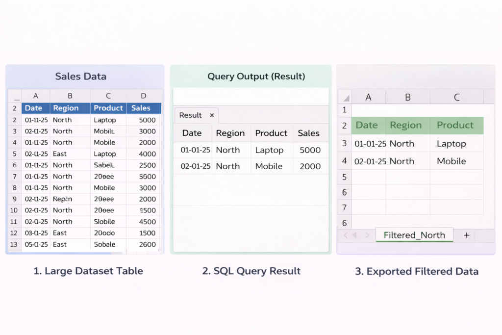
Real SQL Query Example (From Practical Scenario)
Let’s say I want to extract sales data for the North region from a database.
📌 Table: Sales_Data
| Date | Region | Product | Sales |
|---|---|---|---|
| 01-01-25 | North | Laptop | 5000 |
| 01-01-25 | South | Mobile | 3000 |
| 02-01-25 | North | Mobile | 2000 |
SQL Query I Use:
    SELECT *

    FROM Sales_Data

    WHERE Region = 'North';
👉 Output:
- Only records related to the North region will be displayed
More Practical Example (Date Filtering)
If I want last month’s data:
    SELECT *

    FROM Sales_Data

    WHERE Date >= '2025-01-01' AND Date <= '2025-01-31';
This helps me extract only required data instead of downloading the full database. If you want to practice SQL queries, you can use platforms like W3Schools.
In my daily work, instead of asking IT teams for Excel files, I directly use SQL queries to extract data like:
- Daily sales reports
- Region-wise performance
- Product-level data
For example:
- I fetch only the required columns (Date, Region, Sales)
- Apply filters for specific dates or regions
- Export the result into Excel for further analysis
2. Working with Large Datasets (Why SQL is Important)
When the dataset becomes too large (lakhs or millions of rows), Excel becomes slow or may even crash. This is where SQL becomes extremely powerful.
In real companies, data is stored in databases that contain millions of records such as sales transactions, customer data, and product details.
Handling this kind of data manually in Excel is not practical.
Why SQL is Used for Large Data
SQL is designed to work with large datasets efficiently. In my workflow, I use SQL when:
- The data size is too large for Excel
- I need to filter specific records from a huge dataset
- I want to generate reports directly from the database
Instead of downloading the entire dataset, I extract only the required data.
Example: Get Total Sales by Region
    SELECT Region, SUM(Sales) AS Total_Sales

    FROM Sales_Data

    GROUP BY Region;
This query directly gives a summarized result, even if the table contains millions of rows.
💡 Example Output:
| Region | Total_Sales |
|---|---|
| North | 7,00,000 |
| South | 5,50,000 |
Instead of analyzing raw data, I get ready-to-use insights.
Example: Filter Large Dataset
If I want only last 7 days data:
    SELECT *

    FROM Sales_Data

    WHERE Date >= CURRENT_DATE - INTERVAL 7 DAY;
This avoids loading unnecessary data.
Real Example from My Job
In my daily work, sometimes I need to analyze monthly or yearly sales data, which can easily contain lakhs of rows.
Instead of opening everything in Excel:
- I use SQL to filter only required columns
- Apply conditions like region, date, or product
- Generate summarized results using GROUP BY
Then I export only the final dataset into Excel for reporting.
3. Joining Multiple Tables (Real SQL Use Case)
In real jobs, data is rarely stored in a single table.
Instead, it is divided into multiple tables to maintain proper structure and avoid duplication. For example, sales data, customer details, and product information are usually stored separately.
To analyze such data, we need to combine these tables – and this is done using JOIN operations in SQL.
Why JOIN is Important
I often face situations where:
- Sales data contains only Product ID, not product name
- Customer data is stored in a separate table
- Region details are in another table
Without JOIN, it is impossible to get complete insights.
Real Example (Understanding JOIN)
📁 Table 1: Sales_Data
| Product_ID | Sales |
|---|---|
| 101 | 5000 |
| 102 | 3000 |
📁 Table 2: Product_Master
| Product_ID | Product_Name |
|---|---|
| 101 | Laptop |
| 102 | Mobile |
SQL Query Using JOIN
    SELECT

       s.Product_ID,

       p.Product_Name,

       s.Sales

    FROM Sales_Data s

    INNER JOIN Product_Master p

    ON s.Product_ID = p.Product_ID;
💡 Output:
| Product_ID | Product_Name | Sales |
|---|---|---|
| 101 | Laptop | 5000 |
| 102 | Mobile | 3000 |
Now the data becomes meaningful and ready for analysis.
In my workflow, I often receive sales data that only contains IDs. To make the report useful:
- I join sales table with product master to get product names
- Join sales with region table to get location details
- Combine multiple datasets to create a complete report
For example:
- Without JOIN → Only numbers and IDs
- With JOIN → Clear business insights (product, region, sales)
🔄 Types of JOIN I Use
- INNER JOIN: Most commonly used (matching records)
- LEFT JOIN: When I need all data from one table even if match is missing
This is how SQL JOIN helps transform separate datasets into a complete and useful report for decision-making.
Real Example (How SQL Saves Time in Real Jobs)
In real-world scenarios, manually downloading and filtering data in Excel is not practical, especially when working with large datasets.
Instead, SQL allows me to directly fetch the exact data I need using queries.
In my daily MIS work, I use SQL queries to quickly answer business questions without wasting time on manual work.
Practical SQL Queries I Use
1. Get Last 30 Days Sales
Instead of downloading full data, I extract only recent sales:
    SELECT *

    FROM Sales_Data

    WHERE Date >= CURRENT_DATE - INTERVAL 30 DAY;
This gives me only the last 30 days data, which is useful for monthly analysis.
2. Find Top Customers (Highest Sales)
    SELECT Customer_ID, SUM(Sales) AS Total_Sales

    FROM Sales_Data

    GROUP BY Customer_ID

    ORDER BY Total_Sales DESC

    LIMIT 5;
This helps identify top-performing customers based on revenue.
3. Calculate Total Revenue
    SELECT SUM(Sales) AS Total_Revenue

    FROM Sales_Data;
This instantly gives total business revenue without opening Excel.
For example, when my manager asks:
- “What is the total sales this month?”
- “Who are our top 5 customers?”
- “How much revenue did we generate?”
Instead of manually checking Excel files, I simply run SQL queries and get answers within seconds.
This is how SQL helps automate data analysis and makes reporting much faster and more efficient in real jobs.
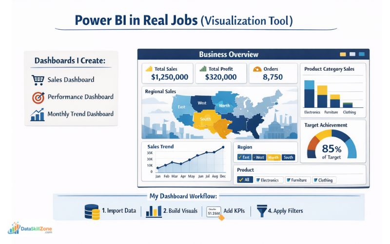
Power BI in Real Jobs (Visualization Tool)
Once data is cleaned and analyzed, the next step is presentation.
Power BI is used for this purpose. To learn Power BI step by step, check our full tutorial on Power BI developer guide.
1. Dashboard Creation (With Real Business Example)
Power BI is mainly used for creating interactive dashboards that help management quickly understand business performance.
Unlike Excel reports, dashboards are more visual, dynamic, and easy to explore.
You can explore Power BI features and download it from the official Microsoft Power BI website.
In my real work as an MIS Executive, once the data is cleaned and analyzed (using Excel or SQL), I use Power BI to convert that data into meaningful dashboards.
Types of Dashboards I Create
Using Power BI, I typically build dashboards such as:
- Sales Dashboard:
Shows total revenue, region-wise sales, and product performance - Performance Dashboard:
Tracks team or business performance against targets - Monthly Trend Dashboard:
Displays sales trends over time using charts
Step-by-Step: How I Create a Dashboard
Here is my typical workflow:
- Import cleaned data from Excel or SQL into Power BI
- Use Power Query to further clean or transform data if needed
- Create relationships between tables (if multiple datasets)
- Add visual elements like:
- Bar charts (for comparison)
- Line charts (for trends)
- Cards (for KPIs like total sales)
- Apply filters and slicers for interactivity
For example, I create a Sales Dashboard where:
- A KPI card shows total monthly sales
- A bar chart compares sales by region
- A line chart shows daily trends
- A slicer allows managers to filter by product or region
This allows management to interact with data instead of reading static reports.
Why Power BI is Important
- Converts data into visual insights
- Makes reports interactive and easy to understand
- Saves time in decision-making
- Widely used in companies for reporting
This is how Power BI is used in real jobs to transform analyzed data into professional
dashboards for business decisions.
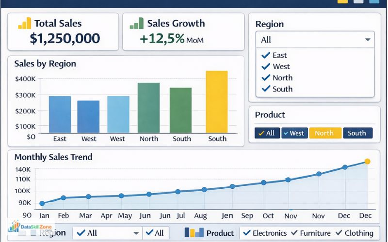
2. Data Visualization (Turning Data into Insights)
Data visualization is one of the most important features of Power BI. While raw data and numbers can be difficult to understand, visual elements like charts and graphs make it much easier to identify trends, patterns, and performance.
Once the data is cleaned and structured, I use Power BI to convert that data into clear and meaningful visuals.
This helps management quickly understand what is happening in the business without going through large Excel sheets.
Types of Visualizations I Use
In real projects, I commonly use the following visuals:
- Charts (Bar / Column Charts):
Used to compare performance, such as region-wise or product-wise sales - Line Graphs:
Used to track trends over time, like daily or monthly sales growth - KPI Indicators (Cards):
Used to display key numbers such as:- Total Sales
- Total Orders
- Growth Percentage
Practical Example from My Work
For example, in a sales dashboard:
- I use a bar chart to compare sales across regions (North, South, etc.)
- A line chart to show how sales are increasing or decreasing over time
- A KPI card to display total monthly revenue
This combination gives a complete view of business performance in one screen. When comparing Excel vs SQL vs Power BI, the right starting point depends on your career goal.
How I Create Visuals in Power BI
- Load cleaned data into Power BI
- Select a visual (chart, graph, or card)
- Drag and drop fields (e.g., Region → Axis, Sales → Values)
- Customize colors, labels, and titles
- Add slicers for filtering
Why Data Visualization is Important:
- Makes complex data easy to understand
- Helps identify trends quickly
- Improves decision-making
- Saves time compared to manual analysis
This is how Power BI helps transform raw data into clear visual insights that support better business decisions.
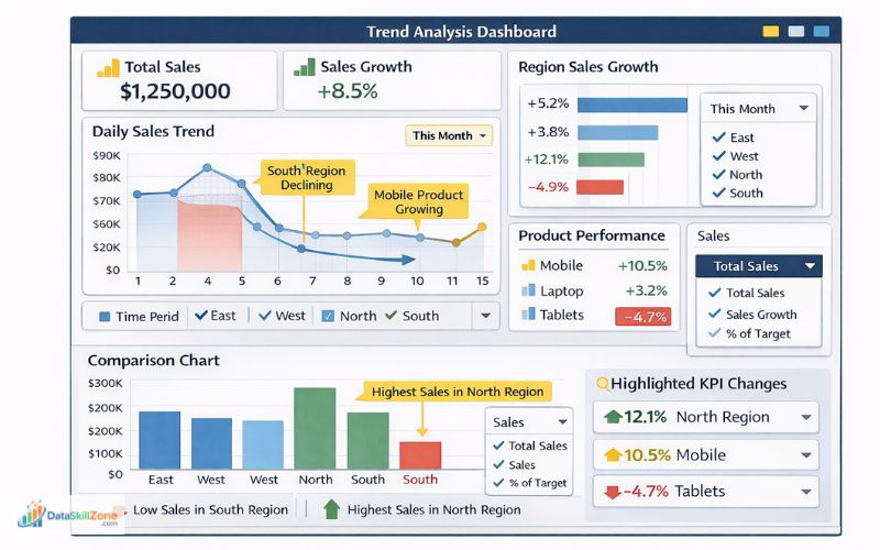
3. Business Insights (Turning Data into Decisions)
The main purpose of using Power BI is not just to create dashboards or visuals, but to generate business insights.
In real jobs, companies are not interested in charts – they want answers and actions. This is where Power BI becomes extremely powerful.
My focus is on analyzing the data and identifying insights that can help management make better decisions.
What Kind of Insights I Generate
Using Power BI dashboards, I regularly identify:
- Trends:
Whether sales are increasing or decreasing over time - Performance Comparison:
Which region or product is performing better or worse - Problem Areas:
Low-performing regions, declining products, or sudden drops in sales
Practical Example from My Work
For example, in a sales dashboard:
- I notice that North region sales are increasing steadily, while South region is declining
- A product like “Mobile” shows consistent growth, while another product is underperforming
- Daily sales trend shows a drop during weekends
These observations are not just numbers – they are insights.
How These Insights Help in Decision-Making
Based on these insights, management can take actions like:
- Increase marketing in low-performing regions
- Focus more on high-performing products
- Investigate reasons for declining sales
- Adjust business strategies
How I Generate Insights in Power BI
- Analyze charts and trends in dashboards
- Apply filters (Region, Product, Date)
- Compare different segments
- Identify patterns or unusual changes
This is how Power BI is used in real jobs – not just for visualization, but for generating meaningful insights that directly impact business decisions.
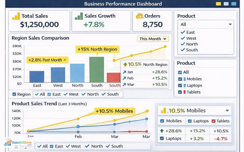
Real Example from My Job (Using Power BI for Decision-Making)
After cleaning and analyzing the data in Excel, the next step in my workflow is to convert that data into a visual dashboard using Power BI. This is where the data becomes more meaningful and easy to understand for management.
In my daily work, I create dashboards that highlight key business metrics such as:
- Monthly Sales Performance:
Total revenue generated in a month along with growth comparison - Region-wise Comparison:
Which regions are performing well and which are underperforming - Product Trends:
Which products are increasing in demand and which are declining
How I Build This in Real Workflow
- Export cleaned data from Excel
- Import data into Power BI
- Create visuals like:
- KPI cards (Total Sales, Growth %)
- Bar charts (Region-wise performance)
- Line charts (Monthly trends)
- Add slicers to filter by product, region, or date
Practical Scenario from My Work
For example, in one of my reports:
- The dashboard showed that North region sales increased by 15% compared to last month
- At the same time, South region sales dropped by 8%
- A specific product category showed consistent growth over 3 months
These insights were clearly visible through the dashboard without checking raw data.
How Managers Use This Dashboard
Instead of reading Excel reports, managers directly use these dashboards to:
- Identify high-performing and low-performing areas
- Make quick decisions on sales strategy
- Plan marketing activities
- Track overall business performance
🔄 Real Workflow (How Excel, SQL, and Power BI Work Together)
This is the most important concept that most beginners don’t understand.
Many people learn Excel, SQL, and Power BI separately, but in real jobs, these tools are used together in a structured workflow.
Many job seekers search for Excel vs SQL vs Power BI to know which skill gives faster job opportunities.
Based on my experience as an MIS Executive, I follow a clear step-by-step process to convert raw data into meaningful business insights.
Actual Workflow Used in Companies
1. SQL → Data Extraction (Starting Point)
The first step is to extract data from the database. In most companies, data is stored in systems, not Excel files.
- I use SQL queries to fetch required data
- Apply filters (date, region, product)
- Select only necessary columns
This ensures I get clean and relevant data instead of downloading large unnecessary datasets.
2. Excel → Data Cleaning & Analysis
Once the data is extracted, I move to Excel for cleaning and analysis.
- Remove duplicates and fix errors
- Use formulas like SUMIFS, COUNTIFS, XLOOKUP
- Create Pivot Tables for summaries
This step converts raw data into structured and meaningful information.
3. Power BI → Visualization & Dashboard
After analysis, the final step is visualization using Power BI.
- Import cleaned data
- Create dashboards with charts and KPIs
- Add slicers for interactivity
This makes data easy to understand for management.
This is the exact workflow followed in most companies, and understanding this will make you job-ready as a data analyst.
Excel vs SQL vs Power BI (Detailed Comparison)
| Feature | Excel | SQL | Power BI |
|---|---|---|---|
| Best For | Data cleaning & quick analysis | Large data handling | Dashboards & visualization |
| Difficulty | Easy | Medium | Easy to Medium |
| Used In Jobs | Daily reports | Database queries | Management dashboards |
| Data Size | Small to medium | Very large | Depends on source |
| Main Strength | Flexibility & formulas | Speed & querying | Visual storytelling |
The real difference between Excel vs SQL vs Power BI becomes clear when you see how companies use these tools in daily work.
❌ Common Mistakes Beginners Make
Many beginners waste months because of the wrong approach.
🚫 Mistakes You Should Avoid
1. Starting Directly with Power BI ❌
Many beginners jump directly into Power BI because dashboards look attractive. However, without understanding data basics, it becomes difficult to build meaningful reports.
Reality:
If your data is not clean, even the best dashboard will be useless.
What to Do Instead:
Start with Excel, learn data cleaning and analysis first, then move to Power BI.
2. Ignoring Excel Basics ❌
Some learners underestimate Excel and try to skip it. But in real jobs, Excel is used almost every day.
Problem:
Without Excel skills, you won’t be able to clean or prepare data properly.
What to Do Instead:
Focus on:
- Formulas (SUMIFS, IF, XLOOKUP)
- Pivot Tables
- Data cleaning techniques
3. Not Practicing with Real Data ❌
Many people only watch tutorials or practice with small sample datasets.
Problem:
Real job data is messy and complex, very different from tutorial examples.
What to Do Instead:
- Practice with real-world datasets
- Create your own reports
- Work on mini projects (sales data, dashboards)
4. Watching Tutorials Without Implementation
Watching videos without practicing is one of the biggest mistakes.
Problem:
You understand concepts but cannot apply them in real situations.
What to Do Instead:
- Apply every concept immediately
- Build small projects
- Try solving real problems
Real Insight from My Experience
When I started, I focused more on practical work rather than just learning theory.
By working on real data and creating reports, I was able to understand how things actually work in a job environment.
Avoiding these mistakes will save you months of effort and help you become job-ready much faster.
Excel vs SQL vs Power BI: Which Tool Should You Learn First?
One of the most common questions beginners ask is:
“Which tool should I learn first – Excel, SQL, or Power BI?”
Based on my real experience as an MIS Executive, the answer is not random. There is a proper learning sequence that makes your journey easier and more practical.
Best Learning Path (Step-by-Step)
1. Start with Excel (Foundation Level)
Excel should always be your first step because it builds your data understanding.
Why Excel First?
- Easy to learn for beginners
- Helps you understand data structure
- Teaches data cleaning and analysis
What to Focus On:
- Basic to advanced formulas (IF, SUMIFS, XLOOKUP)
- Pivot Tables
- Data cleaning techniques
In my job, Excel is used daily — so skipping it is not a good idea.
2. Learn SQL (Data Handling Level)
Once you are comfortable with Excel, the next step is SQL.
Why SQL Next?
- Helps you work with large datasets
- Used in most companies for data extraction
- Essential for backend data handling
What to Focus On:
- SELECT, WHERE, GROUP BY
- JOIN operations
- Filtering and aggregation
SQL makes your profile stronger and opens more job opportunities.
3. Learn Power BI (Visualization Level)
After understanding data and analysis, you should move to Power BI.
Why Power BI Last?
- Requires clean and structured data
- Focuses on visualization and dashboards
What to Focus On:
- Dashboard creation
- Charts and KPIs
- Data modeling basics
This is where you present your work in a professional way.
Real Insight from My Experience
In my workflow:
- I first clean and analyze data in Excel
- Use SQL when dealing with large datasets
- Finally, use Power BI to present insights
This exact sequence is used in real jobs.
Final Recommendation
- Start with Excel → Build strong foundation
- Move to SQL → Handle real data
- Finish with Power BI → Create dashboards
Following this structured learning path will save time, reduce confusion, and make you job-ready faster.
Real Career Advice (From Experience)
From my experience:
- Excel is mandatory
- SQL improves job opportunities
- Power BI adds value
If you focus on practical learning, you can become job-ready faster.
Mini Project Idea (VERY IMPORTANT)
To become job-ready, try this:
Mini Project Idea for Beginners
- Download a small sales dataset
- Clean missing values and duplicates in Excel
- Use formulas like SUMIFS and XLOOKUP
- Create a Pivot Table summary
- Import the cleaned data into Power BI
- Build a dashboard with total sales, top products, and region-wise performance
👉 This single project can boost your resume.
Conclusion
The debate of Excel vs SQL vs Power BI is not about choosing one tool. It is about understanding how they work together.
From my real job experience:
- Excel is the foundation
- SQL is the backbone
- Power BI is the presentation layer
After understanding Excel vs SQL vs Power BI, beginners should start with Excel, then SQL, then Power BI.
If you follow the right learning path and practice with real data, you can build a successful career in data analytics.
Start Your Data Analyst Journey the Right Way
Build your foundation with Excel, strengthen your profile with SQL, and present insights professionally with Power BI.
Frequently Asked Questions
Clear answers to the most common beginner questions about Excel, SQL, and Power BI.
Is Excel enough to become a data analyst?
Excel is a strong starting point, but most data analyst jobs also require SQL and a visualization tool like Power BI.
Should I learn SQL before Power BI?
Yes. SQL helps you understand how to extract and filter data from databases, which makes Power BI easier to use later.
What is the difference between Excel, SQL, and Power BI?
Excel is used for spreadsheets, formulas, cleaning, and quick reporting. SQL is used to query and manage large datasets in databases. Power BI is used to build dashboards and visual reports.
Which tool should beginners learn first?
Most beginners should start with Excel, then learn SQL, and finally move to Power BI.
Can I get a job with Excel and Power BI only?
Some entry-level MIS and reporting jobs may accept Excel and Power BI, but SQL usually improves job chances and salary potential.
How long does it take to learn Excel, SQL, and Power BI?
With regular practice, many beginners can learn the basics of Excel in a few weeks, SQL in 1–2 months, and Power BI in another 1–2 months.

4 Comments