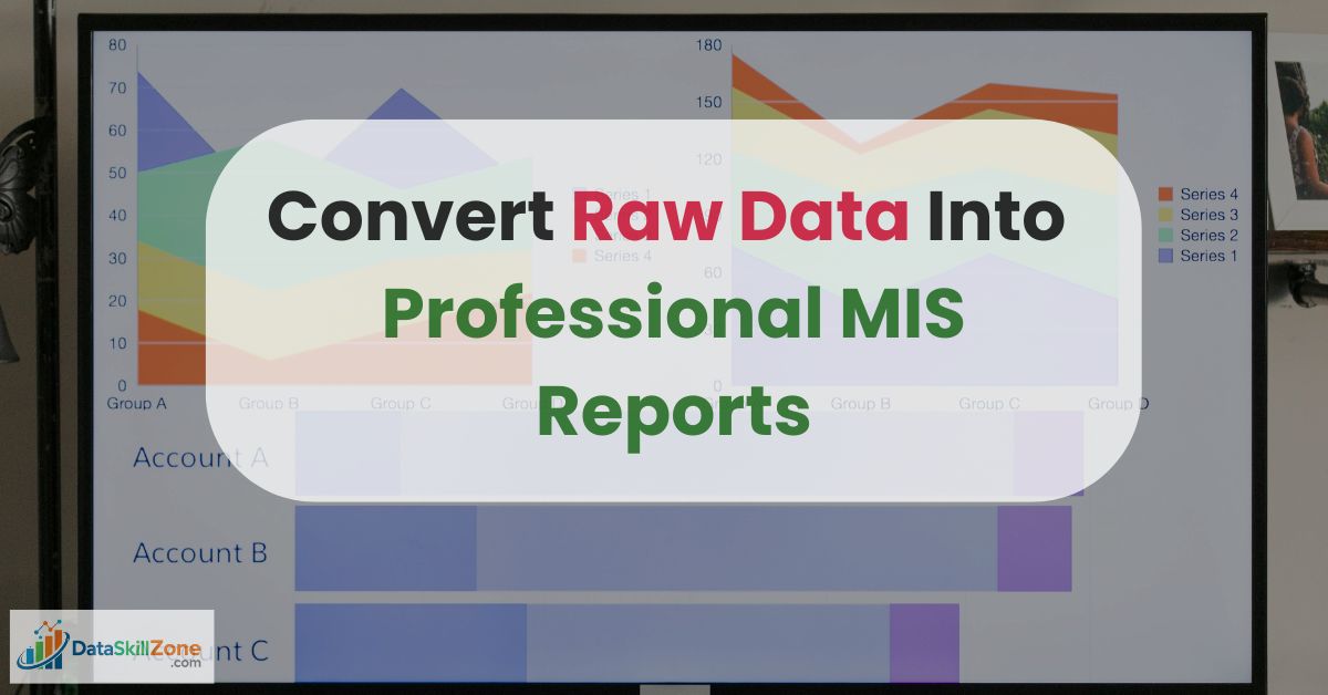
Introduction
Learning how to create an MIS report in Excel can help beginners build practical reporting skills faster.
Earlier I used to think that MIS reporting simply meant preparing an Excel sheet and mailing it to the manager.
That’s it.
Just numbers.
But the first time I handled a real monthly sales file in my job, I realized something very quickly; raw data is not reporting. Raw data is just information sitting quietly in rows and columns. Reporting is when that information starts speaking.
If you are learning how to prepare MIS report in Excel, or trying to improve your skills in MIS reporting, this blog will show you what actually happens inside real offices.
No theory. No over-complicated jargon. Just practical experience.
Because converting raw data into a professional MIS report is not about being an Excel genius. It is about structured thinking.
If you want to understand how MIS reporting works in real business environments, you can also explore a detailed explanation of the MIS Executive Daily Work flow based on 5 years of sales reporting experience, which explains how professionals manage daily reporting tasks in organizations.
Key Takeaways
- Clean raw data before reporting
- Use formulas for KPI calculations
- Pivot Tables save reporting time
- Dashboards improve decision-making
- Accuracy matters before sharing reports
Quick Answer
To create an MIS report in Excel, first clean raw data, organize it into a structured table, calculate KPIs, build Pivot Table summaries, and present insights through charts or dashboards.
The Day I Realized Raw Data Is a Mess
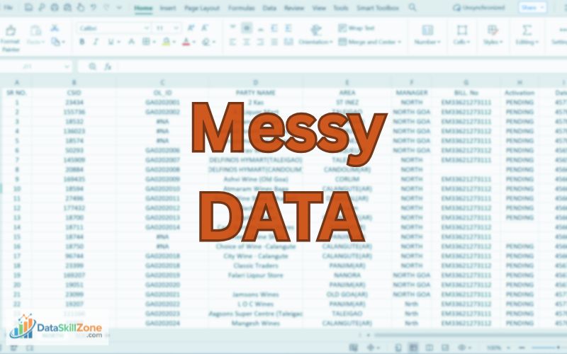
I still remember receiving a sales export file from the ERP system. Around 18,000 rows. I opened it confidently.
Five minutes later, I was confused as:
- Dates were in different formats.
- Some regions were written as “North”, some as “NORTH”, and some as “Nrth”.
- Sales amounts were left-aligned – meaning they were stored as text.
- There were blank rows in between.
- And to make it worse, sales returns were mixed with actual sales.
At that moment, I understood something important.
Before learning advanced Excel formulas for MIS executive roles, you must first learn how to clean data.
Because if your base is wrong, your final MIS report will always be wrong.
Step One (Which Nobody Talks About): Just Observe the Data
Whenever I receive raw sales data now, I don’t immediately start using formulas.
I scroll down slowly to check if:
- Are headers correct?
- Are there merged cells?
- Is any column misaligned?
- Are there blank regions?
- Are numbers formatted properly?
Observation itself solves 20% of reporting errors.
Honestly, just observing the data carefully helped me more than learning complex dashboard tricks.
If you are currently working and want to improve your Excel knowledge, this practical guide explains how to improve Excel skills while working full-time with a realistic learning plan.
Tools Used to Convert Raw Data into Professional MIS Reports
Converting raw data into professional MIS reports requires the right combination of tools and analytical techniques.
Raw data collected from different sources is often unstructured and difficult to interpret. Reporting tools help organize this data, clean inconsistencies, and transform large datasets into clear summaries that managers can easily understand.
In most organizations, analysts rely on a few essential tools to build accurate and visually structured MIS reports.
Below are some commonly used tools that help convert raw data into professional MIS reports:
The right tools help analysts clean messy data, calculate KPIs, build summaries, and present clear reports that managers can understand quickly.
Microsoft Excel
Sorting, filtering, conditional formatting, formulas, and charts make Excel one of the most useful tools for MIS reporting.
Pivot Tables
Pivot Tables summarize large datasets by region, product, month, or department within seconds.
Power Query
Used to clean data, remove duplicates, fix formats, merge files, and automate repetitive preparation tasks.
Power BI
Best for interactive dashboards and visual reports that track KPIs and business performance in real time.
SQL Databases
SQL helps analysts extract specific data from large databases before using it in MIS reports or dashboards.
By using these tools effectively, analysts can transform complex raw data into structured MIS reports that support better business decisions and performance monitoring. If you want to learn these techniques, explore these powerful SQL for data analysis techniques that every data analyst should know.
Many of these Excel functions are officially documented by Microsoft, and you can explore detailed explanations of formulas and features in the Microsoft Excel documentation.
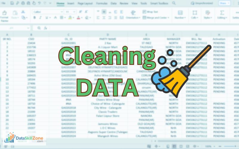
Cleaning the Data (Where Professional Reporting Actually Begins)
Let’s say your raw data looks like this:
Notice: Same data appears in different formats. This is why cleaning and standardization are essential before creating an MIS report in Excel.
If you directly create a Pivot Table from this, you’ll see three different regions.
That’s a disaster.
So first, I standardize the region column.
If extra spaces exist, I use:
- =TRIM(B2)
If numbers are stored as text, I use:
- =VALUE(D2)
Or sometimes simply:
- =D2*1
These look like small Excel formulas for MIS reporting, but they prevent major mistakes later.
Then I remove duplicates from the Data tab.
Then I check totals manually once ; just to confirm nothing strange happened.
Only after cleaning, I move forward.
Turning Raw Sales Data into Meaningful KPIs

Let’s imagine this is your cleaned data:
Now management doesn’t want to see rows.
They want answers.
So first, I calculate Total Sales:
- =SUM(D:D)
Let’s say total comes to ₹2,55,000.
Now I calculate Total Target:
- =SUM(E:E)
Suppose it is ₹2,70,000.
Now Achievement %:
- =Total_Sales/Total_Target
Result: 94%
Total Sales
₹2,55,000
Total Target
₹2,70,000
Achievement
94%
These are the types of summary metrics managers usually check first before reading detailed data.
Now instead of sending raw numbers, I write in the summary:
“Overall achievement stands at 94% of the assigned target for the current period.”
This is where simple data begins to make real business sense
This is what makes a professional monthly MIS report.
A well-structured MIS report in Excel gives managers quick visibility into performance numbers.
Region-Wise Performance (Where Insights Begin)
Now let’s say management asks:
“Which region is underperforming?”
Instead of filtering manually, I use:
- =SUMIFS(D:D, B:B, “North”)
This gives North region sales.
Then calculate:
- =North_Sales / North_Target
If North achievement is 82%, while South is 105%, now you have a story.
You don’t just show numbers.
You write:
“South region exceeded its target by 5%, while North region closed at 82% due to lower distributor billing in the last week.”
That explanation makes you valuable.
Because MIS reporting is not about Excel. It is about interpretation.
Pivot Tables: The Real Game Changer
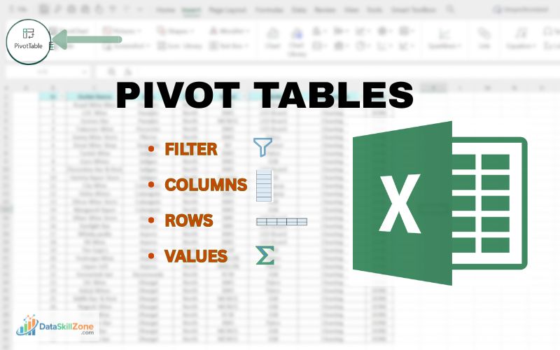
Pivot tables are one of the most powerful tools used when preparing an MIS report in Excel, especially when working with large sales or operational datasets.
If you truly want to turn raw data into a clean, professional MIS dashboard, Pivot Tables will become your go-to tool.
Insert → Pivot Table
Rows → Region
Values → Sales (Sum)
Values → Target (Sum)
Within seconds, 10,000 messy rows become a clean summary table.
Now add calculated field:
- Achievement % = Sales / Target
Now your region-wise MIS report is ready.
From chaos to clarity.
That is the transformation.
This is why Pivot Tables are one of the most useful tools when building an MIS report in Excel.
Growth Percentage (Most Asked in Review Meetings)

If there’s one thing managers always focus on, it’s growth.
If last month sales were ₹2,00,000 and this month ₹2,40,000:
- =(Current-Previous)/Previous
Which becomes:
- =(240000-200000)/200000
Result: 20%
Now your summary becomes:
“Month-on-Month growth stands at 20%, primarily driven by improved performance in Product B.”
Now the report feels more professional and business-focused.
Designing the MIS Report (Keep It Simple)
In the beginning, I used too many colors.
Green, red, blue, orange.
It looked creative; but not professional.
Over time I learned that a clean MIS dashboard should have:
- 4 to 6 KPI cards
- One region comparison chart
- One monthly trend chart
- Clear labels
- No clutter
Professional does not mean complicated.
It means easy to understand within 30 seconds.
If you want to learn the complete process of building structured reports for different departments, check out this guide on how to design MIS reports for sales, HR, and finance teams in Excel, where the entire reporting framework is explained step by step.
A Real Office Situation (Why Accuracy Matters)
One time I made a small mistake in growth percentage because I linked the wrong cell reference.
It was just 3% difference.
In the middle of the meeting, someone pointed out the difference in numbers, and I instantly knew I’d missed something.
That day I learned – always validate totals.
Before sending any MIS report:
- Cross-check grand totals
- Compare with ERP summary
- Recalculate percentages manually once
Accuracy builds credibility.
Credibility builds career growth.
What Actually Makes You Good at MIS Reporting
It’s not just knowing SUMIFS or Pivot Tables.
It’s developing habits like:
- Checking data before trusting it
- Thinking before building dashboard
- Adding small insights below tables
- Understanding business context
- Explaining numbers confidently
When you start writing short insights like:
“Revenue shortfall mainly due to stock availability in West region.”
You stop being a data operator.
You become a reporting professional.
The Difference Between Raw Data and Professional MIS Report
Raw data is just numbers sitting in rows and columns.
For example:
- 18,000 transaction rows
- Dates
- Invoice numbers
- Product codes
- Sales values
If someone opens it, they see numbers – but they don’t immediately understand what’s happening.
A professional MIS report, on the other hand, answers questions like:
- Are we growing or declining?
- Which region is underperforming?
- Are we achieving our targets?
- Which product is driving revenue?
Raw data shows activity.
MIS report shows meaning.
Raw Data vs Professional MIS Report
A professional MIS report converts confusing raw data into structured information that supports faster and better business decisions.
If You’re Learning MIS Reporting Right Now
When most beginners start learning MIS reporting, they immediately search for:
- MIS report format for beginners
- Excel dashboard tutorial step by step
- Advanced Excel formulas list
I did the same thing initially.
It feels productive. You watch videos. You download templates. You try to copy dashboards that look impressive.
But here’s the honest truth:
Watching tutorials doesn’t build reporting confidence.
Practice does.
And not just any practice – the right kind.
Don’t Just Look for Clean Templates
Most tutorials use perfectly structured data:
- Clean dates
- No blank rows
- No duplicate entries
- Proper column headers
- Perfect formatting
Real life is not like that.
In real jobs, your data will look like this:
- Dates in three different formats
- Extra spaces in names
- Missing regions
- Sales returns mixed with sales
- Duplicate invoice entries
- Random blank rows
The first time you open such a file, you feel stuck.
That’s normal.
And that’s exactly where real learning begins.
Instead, Practice This
1️⃣ Download Messy Datasets
Not sample files.
Not polished Excel practice sheets.
Look for raw CSV exports.
Take old company data (if available).
Use open datasets online.
Open the file and just observe.
Don’t jump to formulas immediately.
Ask yourself:
- What is this data about?
- What could management possibly want to know from this?
- Where are the obvious problems?
This step alone improves your analytical thinking.
2️⃣ Clean the Data (This Is Where You Actually Grow)
Cleaning data may feel boring. But this is where most beginners skip — and that’s a mistake.
Start fixing:
- Remove duplicates
- Standardize date format
- Fix spelling inconsistencies
- Fill or handle blank cells
- Separate sales and returns
Use simple tools:
- Remove Duplicates
- TRIM function
- PROPER function
- Text to Columns
- Filters
At this stage, you’re not building a dashboard.
You’re building control.
And control builds confidence.
3️⃣ Create a Summary
Now ask:
If I were a manager, what would I want to see?
Instead of showing 12,000 rows, create:
- Total Sales
- Total Quantity
- Region-wise Summary
- Product-wise Contribution
- Month-wise Trend
Use:
- Pivot Tables
- SUMIFS
- COUNTIFS
- Basic percentage formulas
Keep it simple.
Professional doesn’t mean complex.
It means clear.
4️⃣ Write Insights (This Is What Most People Ignore)
This is the most powerful step.
After building the summary, don’t stop.
Write 3–5 observations like:
- “North region contributed 42% of total sales.”
- “Sales declined in the last week of the month.”
- “Product A generates the highest revenue but lowest margin.”
This step transforms you from an Excel operator into an analyst.
Anyone can create a Pivot Table.
Very few people can explain what it means.
5️⃣ Repeat the Process
Here’s the secret nobody talks about:
Confidence doesn’t come from one perfect dashboard.
It comes from repetition.
Download another messy dataset.
Clean it again.
Summarize again.
Write insights again.
Each time:
- You clean faster
- You think clearer
- You make fewer mistakes
- You understand patterns quicker
After 10–15 repetitions, something changes.
You stop feeling intimidated by raw data.
You start feeling curious instead.
How to Automate MIS Report in Excel
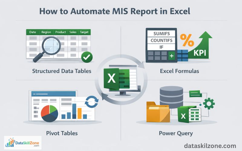
Automating an MIS report in Excel helps save time, reduce manual errors, and update reports faster whenever new data is added.
Step 1: Organize Raw Data
Arrange data into a clean table with columns like Date, Region, Product, Sales, and Target.
Step 2: Create Pivot Tables
Use Pivot Tables to summarize totals, region-wise sales, monthly trends, and performance metrics instantly.
Step 3: Use Power Query
Import and clean raw files automatically without repeating the same formatting work every time.
Step 4: Add Excel Formulas
Use formulas like SUMIFS, COUNTIFS, IF, and percentage formulas for automatic KPI calculations.
Step 5: Build Dashboard
Create charts, KPI cards, and summary visuals so managers can understand results quickly.
Step 6: Refresh and Update
When new data is added, refresh the report to update totals, charts, and dashboards automatically.
How to Maintain MIS Report in Excel
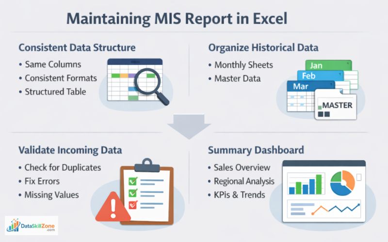
Maintaining an MIS report is just as important as creating one. A well-maintained report stays accurate, organized, and reliable for long-term business decisions.
1. Keep a Consistent Data Structure
Use the same column order and field names every reporting cycle.
- Date
- Region
- Product
- Sales Value
- Target
2. Maintain Monthly or Weekly Sheets
Instead of replacing old data, create separate tabs for each reporting period. This preserves historical records and helps track trends over time.
3. Validate New Data Before Updating
- Check duplicate rows
- Fix missing values
- Review date formats
- Verify totals
- Correct wrong entries
4. Keep a Summary Dashboard
Create one dashboard sheet that automatically pulls totals, KPIs, charts, and summaries from the raw data tables. This saves time for management reviews.
5. Review Report Accuracy Regularly
Before sharing the report, cross-check formulas, Pivot Tables, filters, and totals. Small mistakes can create wrong business decisions.
Quick Tip
A strong MIS report is not just built once — it is maintained consistently with clean data, proper updates, and regular validation.
MIS Report in Excel for Practice
If you are learning how to create an MIS report in Excel, practicing with simple datasets is one of the best ways to improve your confidence. Real practice helps you understand how reporting works in professional environments.
Strong Excel skills are essential for creating professional MIS reports. If you want to improve your analytical capabilities, you should also read the guide on Excel Skills for Data Analysis, where I have explained 15 practical Excel Skills that every Data Analyst should know.
Common MIS Reporting Mistakes
Real MIS Workflow in Office
In many companies, the MIS workflow follows this process: Raw Data → Cleaning → KPI Calculation → Pivot Summary → Dashboard → Management Review. This is why strong Excel reporting skills are valuable in real jobs.
Over time, creating an MIS report in Excel becomes easier with regular practice and repetition.
Final Thoughts: How MIS Reporting Builds Real Career Skills
Mastering how to create an MIS report in Excel is one of the most valuable skills for professionals working in data analysis, MIS reporting, and business operations.
Converting raw data into a professional MIS report is not about being perfect with Excel.
It’s about:
- Clarity. Accuracy. Structure. Responsibility.
Every time you turn 15,000 confusing rows into one clean performance summary, you build analytical thinking.
And slowly, without realizing it, you move from basic MIS reporting toward data analysis.
Raw data will always be messy.
Your job is to bring order to it.
That’s the real skill.
From my experience in MIS reporting roles, the biggest improvement comes when raw data is converted into simple reports that managers can understand quickly.
Why This Skill Matters for Your Career
MIS reporting skills can help you grow into roles like MIS Executive, Reporting Analyst, Business Analyst, Data Analyst, or Dashboard Developer.
Frequently Asked Questions
Clear answers to the most common beginner questions about creating professional MIS reports in Excel.
What is an MIS report in Excel?
An MIS report in Excel is a structured report that summarizes business data such as sales, operations, targets, or performance metrics. It helps managers review results quickly and make better decisions.
How do beginners create an MIS report in Excel?
Beginners can start by organizing raw data into clean tables, using formulas, creating Pivot Tables, and building simple summary dashboards with charts and KPIs.
Which Excel formulas are commonly used in MIS reporting?
Common formulas include SUMIFS, COUNTIFS, IF, VLOOKUP/XLOOKUP, TRIM, VALUE, percentage formulas, and date functions depending on the reporting requirement.
Is Pivot Table necessary for MIS reporting?
Pivot Tables are not mandatory, but they are one of the fastest and most useful tools for summarizing large datasets, comparing regions, products, and monthly trends.
Can I automate an MIS report in Excel?
Yes. You can automate MIS reports using Pivot Table refresh, formulas, Power Query, structured tables, and dashboards that update automatically when new data is added.
What skills are required for an MIS Executive?
Important skills include Excel reporting, data cleaning, Pivot Tables, formulas, accuracy checking, dashboard creation, communication, and understanding business performance metrics.

5 Comments